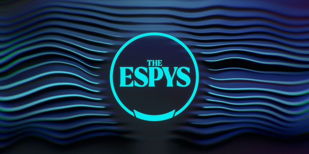
Top athletes across a breadth of sports gathered at the Dolby Theater in Hollywood, CA last Wednesday for The ESPYS, hanging up their cleats and gear for the evening and donning heels and glitzy garb instead. While most coverage on the night addresses the actual award winners and the incredible feats of athleticism performed by these demigods, here at PRINT, we’re much more interested in the design of The ESPYS.


The branding masters over at the creative agency loyalkaspar developed and executed the holistic design system for the show, which is dominated by bright blue and magenta hues in energetic wavy line patterns. Creative Director at loyalkaspar, Chris Harmon, and loyalkaspar cofounder and CCO, Beat Baudenbacher, unpack the system they created with their team below.


What was the brief given to loyalkaspar for this ESPYS design system?
Chris Harmon: The brief was to create a fresh take on The ESPYS brand from the ground up, and develop a comprehensive design system and brand toolkit that would support nomination packages, print design, digital, and marketing. The design system would also directly influence other aspects of the brand and the show, such as ticket stubs, red carpet prints, digital promotional banners, and more.


What are the key considerations in designing and developing an awards show package?
Harmon: When designing for a live show, it’s crucial to consider the unpredictability of the event. Anything can happen and the cameras may need to suddenly focus on a specific location, so the design needs to be visually engaging and captivating both in wide shots and close-ups. In the case of The ESPYS, the size of the three main screens was a unique factor. They were so massive that movement that may feel moderate on a 20-inch monitor appeared significantly faster on a 70-foot wide screen.


Beat Baudenbacher: Just like any media brand, logos for screens need to be bold enough to hold their own at small scales, but offer enough detail to hold somebody’s attention at large scales. An awards show logo in particular, when you see it large behind a speaker for a long time, needs to be particularly well-crafted. We modeled it in 3D in what we called a “modern chisel”— a take on the sort of “classic Roman chisel”— that made the logo interesting to look at for a long time because there’s a lot there for your eye to explore.


Can you explain the decision-making process behind the color palette and overall aesthetic of the design package?
Harmon: Our approach to color was influenced by how The ESPYS categories celebrate excellence in sports without being limited to a specific sport or gender. This meant there was no logic in following any preconceived tropes, such as blue for water sports, or green for field sports, or colors commonly associated with particular teams or fanbases. This landed us on a very electric and overly saturated color palette.
Baudenbacher: When we started to look at the existing logomark, it felt like it could have more personality. The typeface itself was a version of Times New Roman, stuck inside a circle, so we wanted to connect the new shape more to the physical shape of the trophy itself— that’s where what we call “the notch” came from. It’s the very top of the base of the trophy; the viewer doesn’t even necessarily need to understand that the sphere symbol connects to the trophy because, even without knowing that, it creates a much more interesting and dynamic shape.
We also wanted the typography to feel bolder without losing the serif heritage, which is how we ended up with this particular wordmark, with pretty extreme contrast in stroke weight. It feels classy, but when you add the hot neon colors, it feels contemporary and cool.


What vibe or mood do you hope viewers experienced while watching the show?
Harmon: The ESPYS is an award show that recognizes the absolute best in sports. Awards are traditionally associated with a restrained sense of classiness, luxury, and glamour, yet the recipients of these awards are exceptional athletes known for their intense energy and extraordinary performances. We aimed to capture this tension and combine the themes of both a formal awards show and a lively concert.
Baudenbacher: The goal overall was to make The ESPYS brand more modern without losing the awards vibe. Internally, we talked about “smashing the Oscars and VMAs together,” meaning we wanted high-quality materials— mostly silvers, because the trophy is silver, but then contrast that with hot, neon accent colors. With The ESPYS in particular, because they give athletes a platform to talk about social issues, racial justice, etc., it was important to be able to dial the look down for more serious parts of the show, like the Jimmy V. section, the Arthur Ashe award for courage, etc.
One of our guiding principles was that every piece of creative should have both moods: classy and current.

—
This article first appeared on printmag.com
Seeking to build and grow your brand using the force of consumer insight, strategic foresight, creative disruption and technology prowess? Talk to us at +971 50 6254340 or engage@groupisd.com or visit www.groupisd.com/story

