“Consumers are jaded about advertising in a way they weren’t several decades ago.”
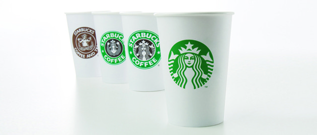
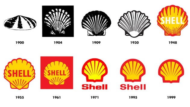
MasterCard’s move reflects a wider shift among some of the most widely recognized global brands to de-emphasize the text in their logos, or remove it altogether. Nike was among the first brands to do this, in 1995, when its swoosh began to appear with the words “Just Do It,” and then without any words at all. Apple, McDonald’s, and other brands followed a similar trajectory, gravitating toward entirely textless symbols after a period of transition with logos that had taglines like “Think Different” or “I’m lovin’ it.”

This shift is ostensibly in accordance with a more streamlined approach to design, as well as certain features of the modern economy: Symbols work better than long names on computer screens and apps, and they allow for greater flexibility if a company wants to dabble in multiple industries at once. For instance, names like Starbucks Coffee and MasterCard are tied to specific products in ways that symbols are not, which can be a disadvantage at a time when it’s perfectly plausible for a company that makes phones to make cars too. Additionally, visual cues can travel across borders more easily, because they eliminate the need for translation.

Among that arsenal is what’s called “debranding” or “decorporatizing”—a strategy based on paring down that can only be deployed by the most identifiable of brands. Some marketers believe that debranding can make global brands appear “less corporate” and “more personal” to consumers. Nameless logos can evoke more personal and immediate reactions—which is important in a media environment with plenty of possible distractions and diversions. “Researchers have demonstrated that the use of visual imagery (vs. verbal imagery) in advertising increases consumers’ attention and challenges them to interpret and understand the ad’s message in a more active manner than words do,” wrote Jill J. Avery, a senior lecturer at Harvard Business School, in an email. “This process of interpretation or ‘elaboration’ produces a higher quantity of mental images and, in many cases, a more personalized understanding of the ad’s message.” In short, it is easier to make associations based on two bright, primary-colored balls than it is with the word MasterCard.

The need to get personal and friendly is particularly germane to young people, the target market of many global consumer-product enterprises. It’s likely that this factored into MasterCard’s decision to rebrand. As an increasing number of consumers—especially younger ones—prefer to make transactions on their phones rather than using cash or cards, and shy away from racking up credit-card debt, one worry for MasterCard’s investors is that the company hasn’t fully broken into the mobile-payments market yet. By contrast, PayPal—another brand that carried out a visual refresh a few years ago in which it de-emphasized its name on its logo—enjoys a substantial Millennial user base, a good portion of which is loyal to Venmo, a popular mobile-payment app it acquired.
The benefits of debranding can be huge. One of the most successful executions of it has been the “Share a Coke” promotion, for which Coca-Cola replaced its name on bottles with people’s first names, like Sarah and David, and other everyday monikers, like Mom and Dad. The campaign increased Coca-Cola’s U.S. sales by more than 2 percent and, in doing so, helped reverse more than 10 years of decline in Coke consumption in the U.S.

The advertising industry likes to call this type of marketing “authentic.” Cohn & Wolfe compiles an annual list of the “world’s most authentic brands,” drawing on surveys of nearly 12,000 consumers in 14 countries. This year’s Top 20 includes Paypal and MasterCard, as well as Coca-Cola. Authenticity, of course, is a funny thing when it comes to marketing: Asserting one’s authenticity feels, well, inauthentic. At a time when consumers are placing more and more importance on companies that feel genuine rather than corporate, it makes all too much sense that marketers would start trying to make it more difficult to distinguish between the two.
This article first appeared in www.theatlantic.com


