FROM GOOGLE AND SNOOP DOGG TO HILLARY CLINTON AND THE NEW SCHOOL, IT’S BEEN AN EXCITING AND CONTROVERSIAL YEAR IN LOGOS AND BRANDING.
Leading into an election year, branding always gets red, white, and blue. But candidates’ branding wasn’t the only thing that made a splash in 2015. Google gave us a new logo in 16 years. Sonos visualized as something other than a waveform. Pentagram made a brand of premium weed for Snoop Dogg. (Is this real life?) And, yes, the Hillary Clinton campaign broke the Internet. Here are the best and worst moments in branding in 2015.
Best: Google’s New Logo
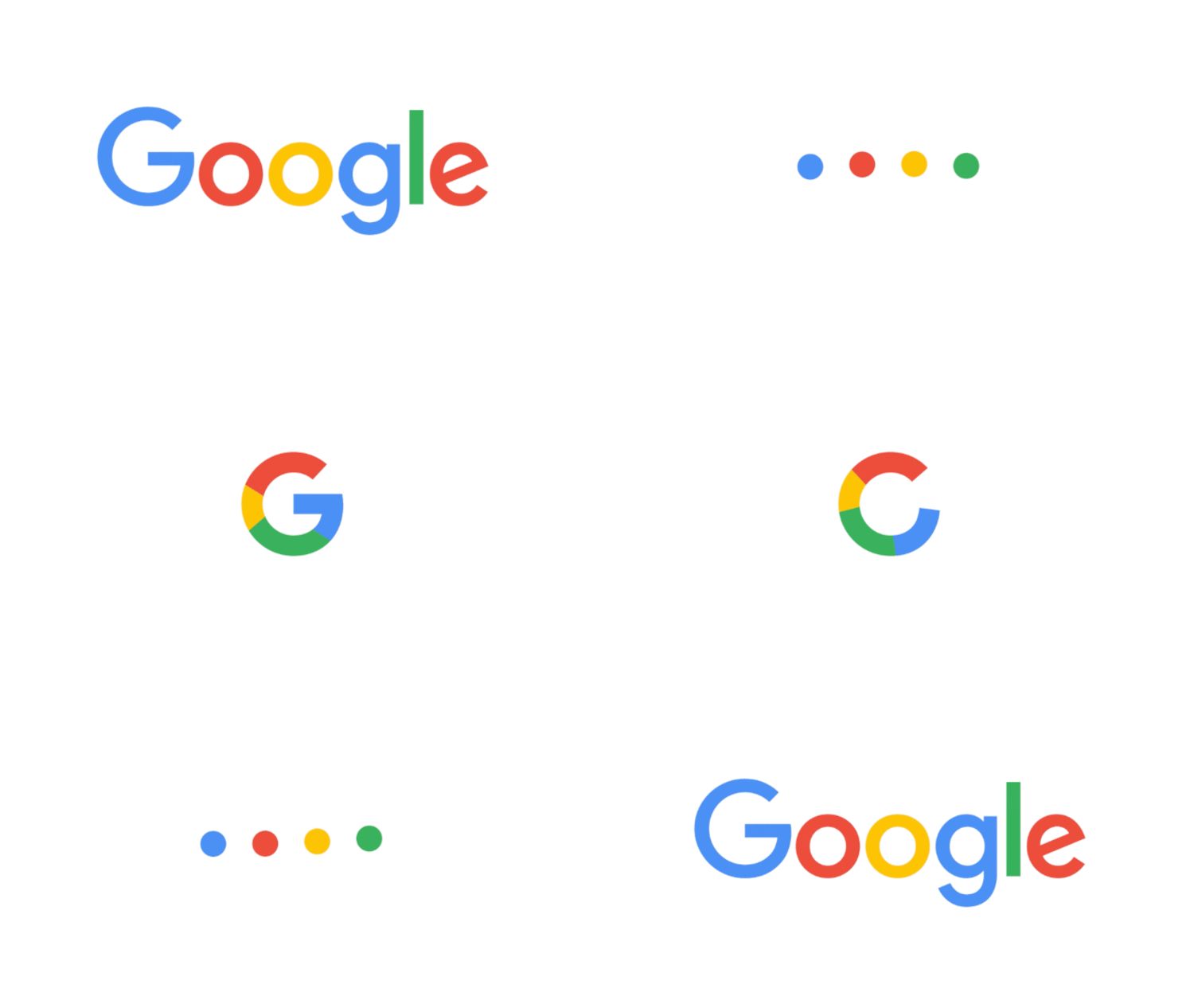
After 16 years of stagnation, Google’s now-stellar design team unveiled a new Google logo— a rounder, sans serif departure from their encyclopedic roots. Experts we spoke to loved that the logo was built as both a noun and a verb, capable of reshaping itself to actively listen or think for a future in which Google is everywhere.
Best: Shake Shack Retrospective
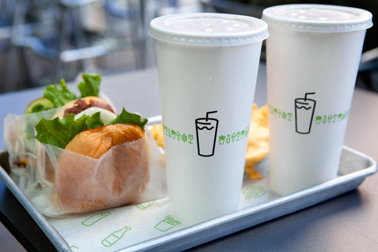
As Shake Shack prepared its $1.6 billion IPO, Pentagram’s Paula Scher told the story of the burger chain’s branding process for the first time. Spoiler: It was done for free.
Best: Spotify Gets Colorful
White, green, and black. That was the “steady drumbeat” of Spotify’s brand until SXSW, when they unveiled a new brand standard that celebrates colors with as much vibrance as Spotify’s musical selections.
Best: Sonos Shows Us Sound
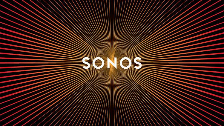
When logos go viral, it’s usually for the worst reasons. Untrue with Sonos’s new branding, which uses a starburst backdrop that, when scrolling on social networks Facebook and Twitter, appears to vibrate with serious bass. But the phenomenon started as a happy accident.
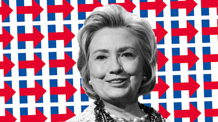
Worst? Hilary’s H
Rumored to be designed by Pentagram’s Michael Beirut, Hillary Clinton’s arrowed H hit with massive criticism, ranging from the point that the arrow pointed right, to arguments that it looked like a hospital sign. The logo has since recovered, revealing its hidden ability to scale to different causes. But some of us are still partial to this 5-day Hillary brand remake, while other experts thought Jeb! was just tops.
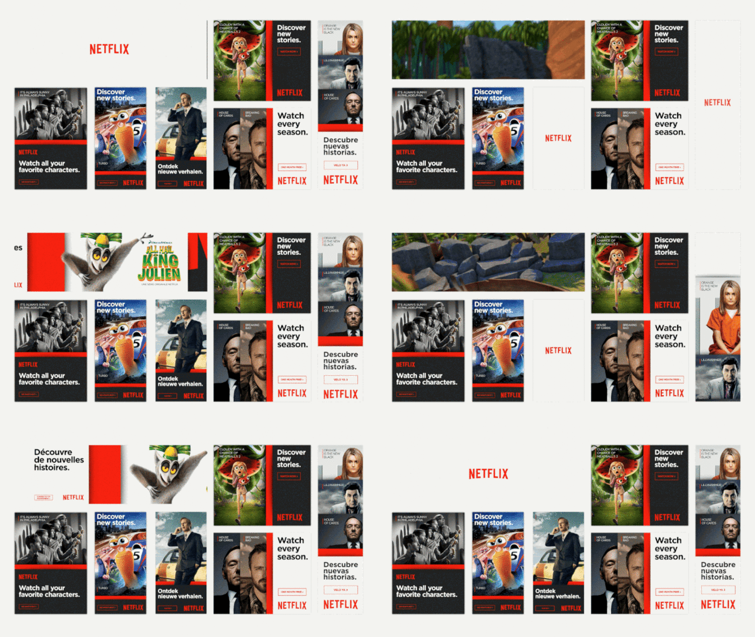
Best: Netflix Shows Character
Frank Underwood. Red. The perfect quip. It’s a three-part system for Netflix’s new brand, and while it sounds almost stupid-simple, the system is a clever, scalable gradient to promote stars like Kevin Spacey or the business of Netflix itself.
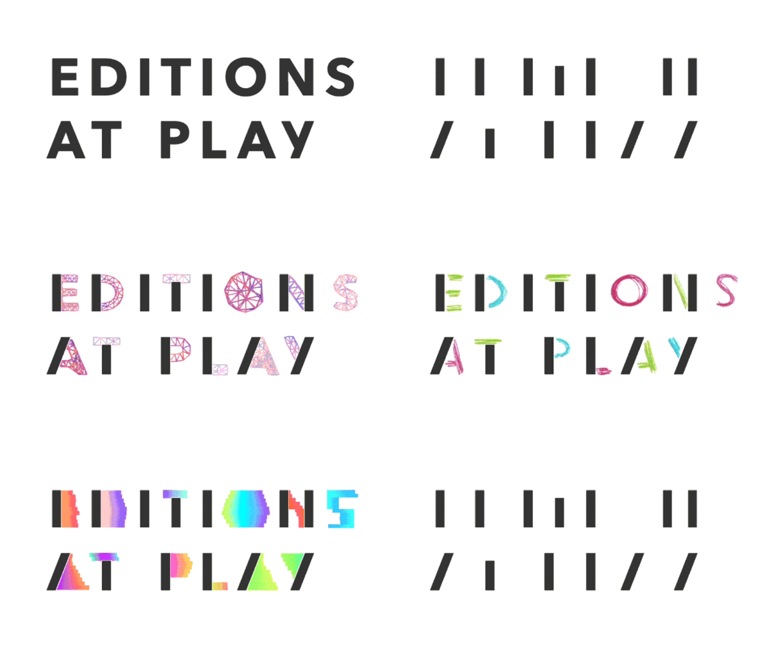
Best: Google’s Half-Print, Half-Digital Logo For Digital Books
How do you brand an ebook service without using old paper-bound metaphors? Universal Everything broke down language itself into a Jekyll and Hyde identity: a few static marks gave a nod to traditional print, while an infinite array of animations brought out the wild side of modern storytelling.
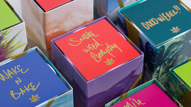
Best: Snoop Dogg’s Line Of Weed
In a mashup no one saw coming, Pentagram’s Emily Oberman crafted a brand for Snoop Dogg’s line of buds and marijuana-infused edibles. It juggles so many things well: A premium feel, a feminine-friendly color and icon set, and allusions to hip hop’s most iconic weed one-liners, like, “smoke weed everyday.” It’s anything but your stereotypical stoner paraphernalia, and the perfect brand to signify the changing face of pot in the wake of increasing legalization.
Best: Ikea’s Fan Logo
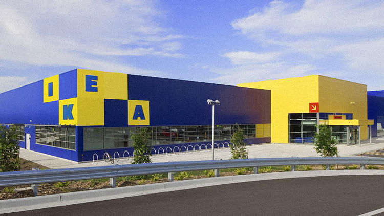
It’s not real, but we adore the fan fiction Ikea branding by Freytag Anderson. Its letters reconfigure into various structures. You know, just like Ikea furniture!
Worst? The New School’s New Brand
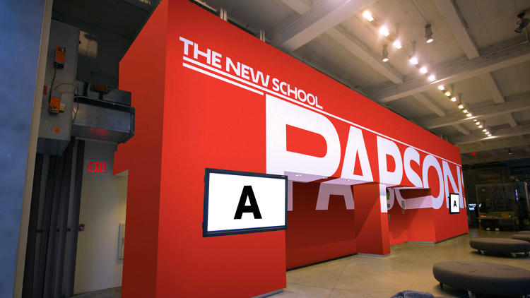
The New School’s 2005 brand makeover had a major shortcoming. Whether it was their Parson’s School of Design or College of the Performing Arts, all of the schools underneath the New School umbrella didn’t necessarily look like they were cut from the same cloth to prospective students. So Pentagram created an algorithmic typeface that could put all of the schools under one visual umbrella. Even still, many designerscriticized the approach, pointing out its ’70s throwback feel evoking everything from LSD-infused rock ‘n roll to Star Wars.
Best: How Facebook Unified Its Brand
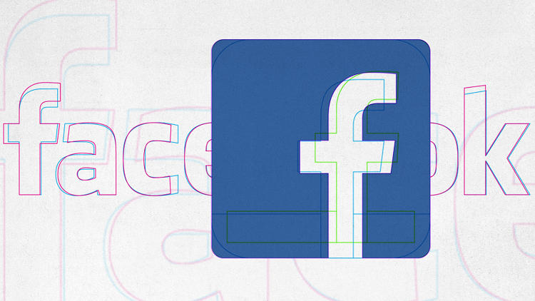
Facebook hasn’t had one landmark rebranding that’s turned things around, but as their former designer Ben Barry illustrated earlier this year, they’ve slowly made a lot of good decisions that have added up, balancing a bit of taste with recognizability.
Definite Worst: IHOP’s Deranged Pancake Clown
When IHOP revealed a new logo that smiled right at you, what they didn’t anticipate was that smiles can actually be very, very creepy.
Best: New York Times Magazine Relaunches
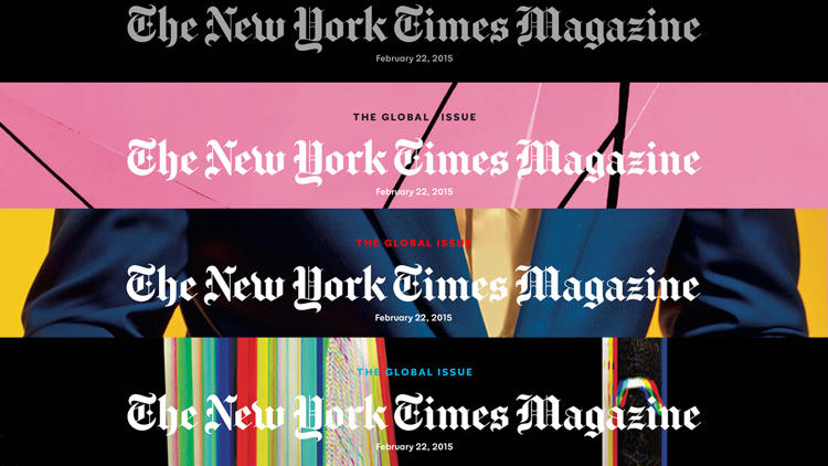
Unifying print and online presence with an refined logo that doesn’t sacrifice its gothic punch, New York TImes Magazine relaunched this year with a classy East Coast confidence.

