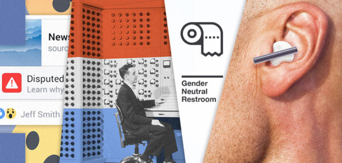
UX is no longer just about user experience. It’s about social justice.
2016 raised the stakes, didn’t it? Just a year ago, it seemed like a big deal that iOS is always bugging us about our iCloud storage. Now, designers are asking themselves questions like, “wait, did my UI just give rise to a megalomaniac?”
[Photo: iDriss Fettoul via Unsplash]
We talked to designers from across the industry to find out what UX challenges await us in the coming year. From fighting hate crimes in the real world to bringing transparency to the algorithms that govern the virtual one, one theme emerged from the group: UX is no longer just about user experience; it’s about social justice.
FIXING FAKE NEWS
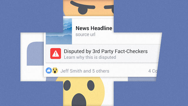
Fake news is an epidemic. Up to 75% of people believe the bogus headlinesthey read on sites like Facebook—a problem so great that it may have swayed the results of the 2016 election.
Truthfully, fake news is a broad problem that lives at the core of how the internet works. It’s about more than Facebook headlines or Google search results. How can we curb the spread of misinformation, when misinformation can spread worldwide, instantly?
“Truth in digital is an overall concern. Fake news is the tip of the spear,” says Mark Rolston, founder of Argodesign. “It’s certainly pressing and has potential for catastrophic damage to our ability to govern if we don’t take it seriously. But I think the issue also goes much deeper. Twitter essentially lets anyone stand on the same mountaintop and shout anything they want to the world. There’s no more filter. No more ‘grading’ of those doing the shouting. Nutjob or statesman? You decide.”
As for Facebook, the company has announced the first of many updates to curb the spread of fake news, but it’s not enough—most fake news still sounds like it will be shareable, and much of it will not be flagged as fake.
This year, we need to see every platform on the internet assess its culpability in this problem. Because Facebook isn’t writing the fake news—but it has certainly given these companies a microphone.

MAKING REAL (AND VIRTUAL) ENVIRONMENTS FEEL INCLUSIVE
As hate crimes have risen, it’s become even more apparent just how vital inclusivity and civility are for a healthy society. What role can design play in making everyone feel welcomed and heard?
Our shared environments need to be built for inclusion. This issue ranges from how we brand gender neutral bathrooms, to rethinking the design of places of worship, to reaffirming at the local level that communities believe black lives matter following police shootings that end in a widespread psychological condition that the American Psychological Association dubs “racial trauma.”

[Source image: Flickr user Darron Birgenheier]
The internet has largely failed in this endeavor, too. Even as companies like Twitter finally crack down on hate speech, we’ve seen the rise of new Twitter clones filled with open prejudice. But that doesn’t mean that we can afford to give up. The internet is where we live an increasing amount of our lives, and those lives shouldn’t involve harassment.
One sign of encouragement in the last year was the work of Google’s VR division. The team’s early experiments show how small tweaks to the user experience can prevent trolling. In one instance, they showed how just by desaturating the colors of a virtual environment, they could deter a poker player who went to attack their competition after a losing hand. But these sorts of lessons can’t live in a single app; they need to be baked into the core of all our products.

[Photo: Bettmann/Getty Images]
SURFACING MANIPULATION AND DISCRIMINATION IN ALGORITHMS
We live in a digital world of extreme convenience. Complex machinery crunches numbers in the background, taking our preferences into account before shaping our digital world—whether that means serving us an ad for socks or a story shared by an acquaintance.
The issue is that there’s no transparency in how these algorithms work. “The fundamental problem, I think, is that we need to understand how our world works if we want to have a healthy society. And a lot of our world is digital. How do we understand it?” asks designer Richard Pope. “Why are we seeing a news article? Why has the government decided to give me a benefit or deny me a benefit? How do we understand those decisions. There’s not one way of doing that, but there are many missing design patterns in that.”
It’s a problem even when things appear to be working correctly. But more importantly, a lack of transparency also means we have no way to fix things when they go wrong. In fact, at the code level, experts have told me that their own software will make decisions that they don’t understand.
We need UX fixes for all of this—especially because machine learning is allowing these algorithms to self-train their own biases. “Since the algorithms ‘learn’ from existing data, and aren’t ‘smart’ in the way humans are smart, mistakes and/or human biases can lead to mis-predicting something based on a person’s gender, race, religion, history, acquaintances, etc.,” says Mike Stebbins, senior mechanical designer at Teague. “Take the Google photo app accidentally classifying African-Americans as gorillas, or the Chicago Police Department warning people who were on their ‘heat list’ that they were being watched; the list was generated by looking at a person’s acquaintances, those people’s arrest histories, and whether those people had been shot in the past.”
Pope recently imagined how algorithms could break down their decision making into plain language. It’s a promising proposal. But in truth, getting transparency from these algorithms may involve federal intervention. We may need laws that mandate that we be able to see how our algorithms work, not unlike being able to see the terms and conditions on a credit card.

[Photo: Argodesign]
CHATBOTS THAT HAVE SOMETHING TO SAY, BOTH TO US AND EACH OTHER
We’re surrounded by AI assistants from Google, Amazon, Apple, and Microsoft. Yet while these personalities are quick with a joke, they’re not good for much else. Their creators have focused on being conversational for the sake of being conversational, a cloying reincarnation of skeuomorphism. Do I really need to have a five-minute fake texting conversation to get three news headlines that I could have skimmed in seconds?
The very tone of these assistants is a UX problem. Rolston suggests that “we learn to let the computer sound like what it is—a computer with limited context and personality.” We should tone down the forced social graces that we’ve ascribed to Siri and Cortana, which verbally tap dance with wit for our enjoyment, and just let them be boring, old, helpful machines instead.
On the technical side of things, these AIs aren’t ready to overcome the limits of their own fragmentation. This is a critical aspect of user experience—the various AI systems that populate our homes need to be able to acknowledge one another as interconnected systems at the software level with the same ease that a few friends might around a dinner table. Or at least the same ease of an iPhone that can run Gmail. “There will not be one ecosystem that rules them all,” says Charles Fulford, executive creative director at Elephant. “As AI drives Google, Amazon, and Apple . . . these will need to be able to speak with one another—not to mention the bizillion other AI devices and assistants. Creating a protocol to link all these systems together will be a big challenge.”
[Photo: Jewel Samad/AFP/Getty Images]
BURSTING THE SOCIAL MEDIA BUBBLE
Fake news is only part of the problem with social media. We’re part of a society splitting in two, and social media is failing to bridge that divide. It’s letting us live in bubbles—or if you want another analogy, it’s letting us hang at a slow-burn party of like-minded people.
“The social media echo chamber is problematic because it typically aligns with what you already think because of the algorithms used by social networks,” says Matt McElvogue, associate creative director at Teague. “This leads to a lack of exposure that (maybe) existed more when we read/watched things that weren’t served to us by AI that aims to make us happy.”
In fact, our AIs aren’t always trained to make us happy—Facebook has admitted to experimentally showing us things specifically to make us upset. But as one Facebook designer put it to me years ago when I asked why there was no dislike button, “It’s because I’m trying to connect you with your family!” Even that very racist uncle.
Truly, neither painting an illusion of like-mindedness nor presenting users with a 24/7 partisan fight is the right way to burst the social media bubble of 2016. Which is exactly why it’s on our list of biggest UX challenges for 2017.

[Pattern: MaleWitch via Shutterstock. Photo: Fredrik Skold/Getty Images]
ENSURING OUR INTERFACES WORK FOR US, NOT AGAINST US
They’re called “dark patterns.” And they’re not so much bad UI as they are evil UI. Whether it’s an ad that pops up to shame you into subscribing to a newsletter when you leave a site (looking at you FxW), or the way Airbnb displays how many other people are looking at a property to get your blood boiling even when it doesn’t matter, or the way Uber has buried the ability to type in your pickup address so that it might move you half a block to optimize its own driver routes, or the way Amazon uses Dash buttons to sneak by deals that aren’t always the cheapest, in 2016, our user interfaces routinely conspired against us—and often under the guise of user-friendly design.
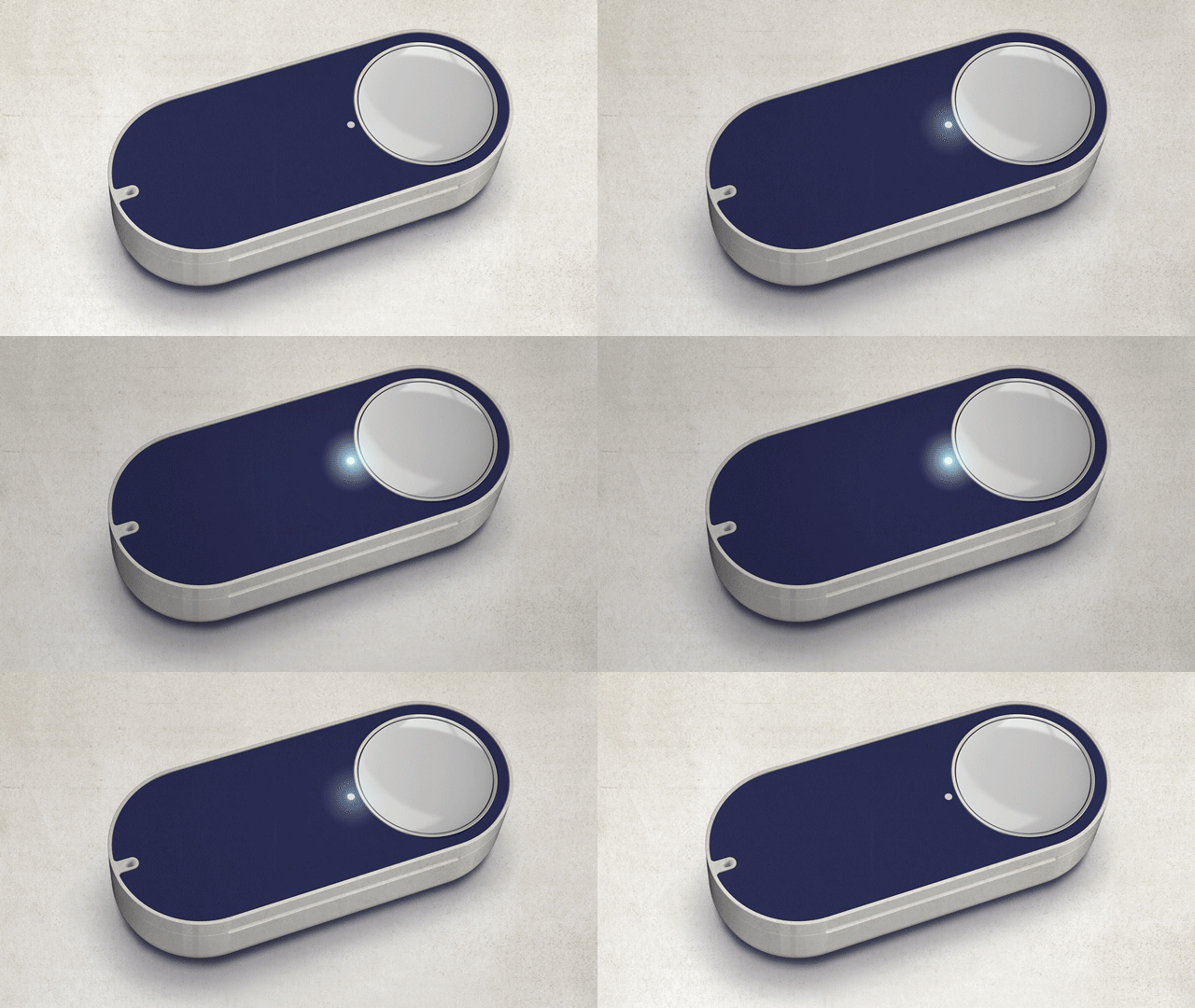
The problem with dark patterns is that they’re built to protect corporate interests and improve bottom lines—and the best ones might work without the user ever realizing it. (Plus, Uber can make a superb argument, I’m sure, about how it can save everyone time if you’re willing to walk a few steps out of your way. In some cases, it’s feasible that dark UX might actually benefit the consumer.) But it should be the challenge of every UX designer to see it as an ethical imperative to empower the user wherever possible, to alleviate the burden of unnecessary stress, and to offer them the best, clearest information possible. Ultimately, the customer is always right—and that needs to be true at every touchpoint of an experience.
This article first appeared in www.fastcodesign.com
Seeking to build and grow your brand using the force of consumer insight, strategic foresight, creative disruption and technology prowess? Talk to us at +9714 3867728 or mail: info@groupisd.com or visit www.groupisd.com

