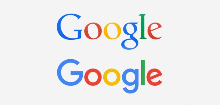
WE ASKED SOME OF THE BIGGEST NAMES IN BRANDING FOR THEIR TAKE ON THE GOOGLE LOGO. THEY LOVE THE MOTION, BUT SOME QUESTION THE WORD MARK.
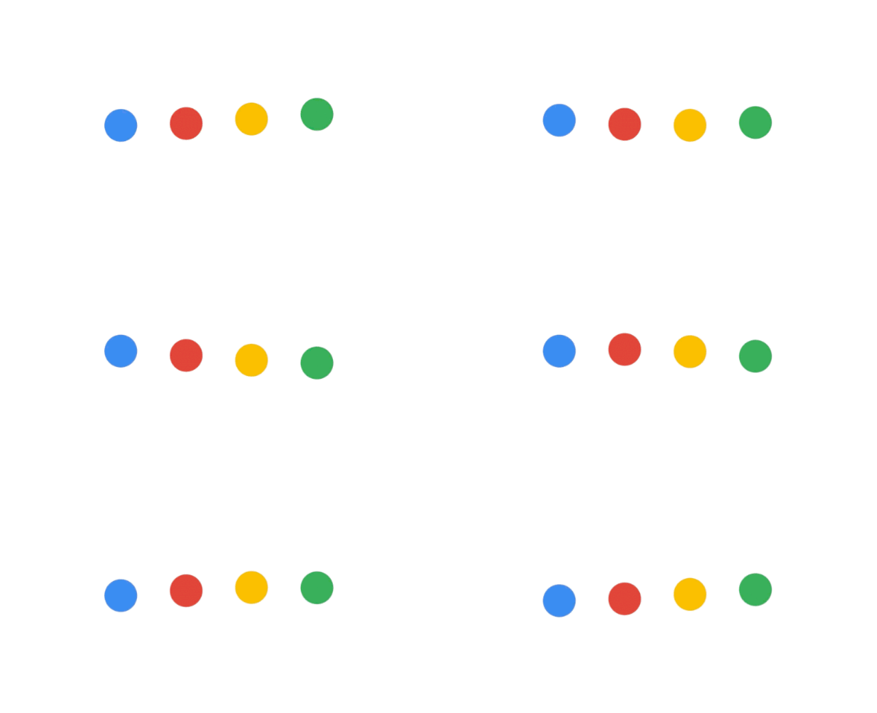
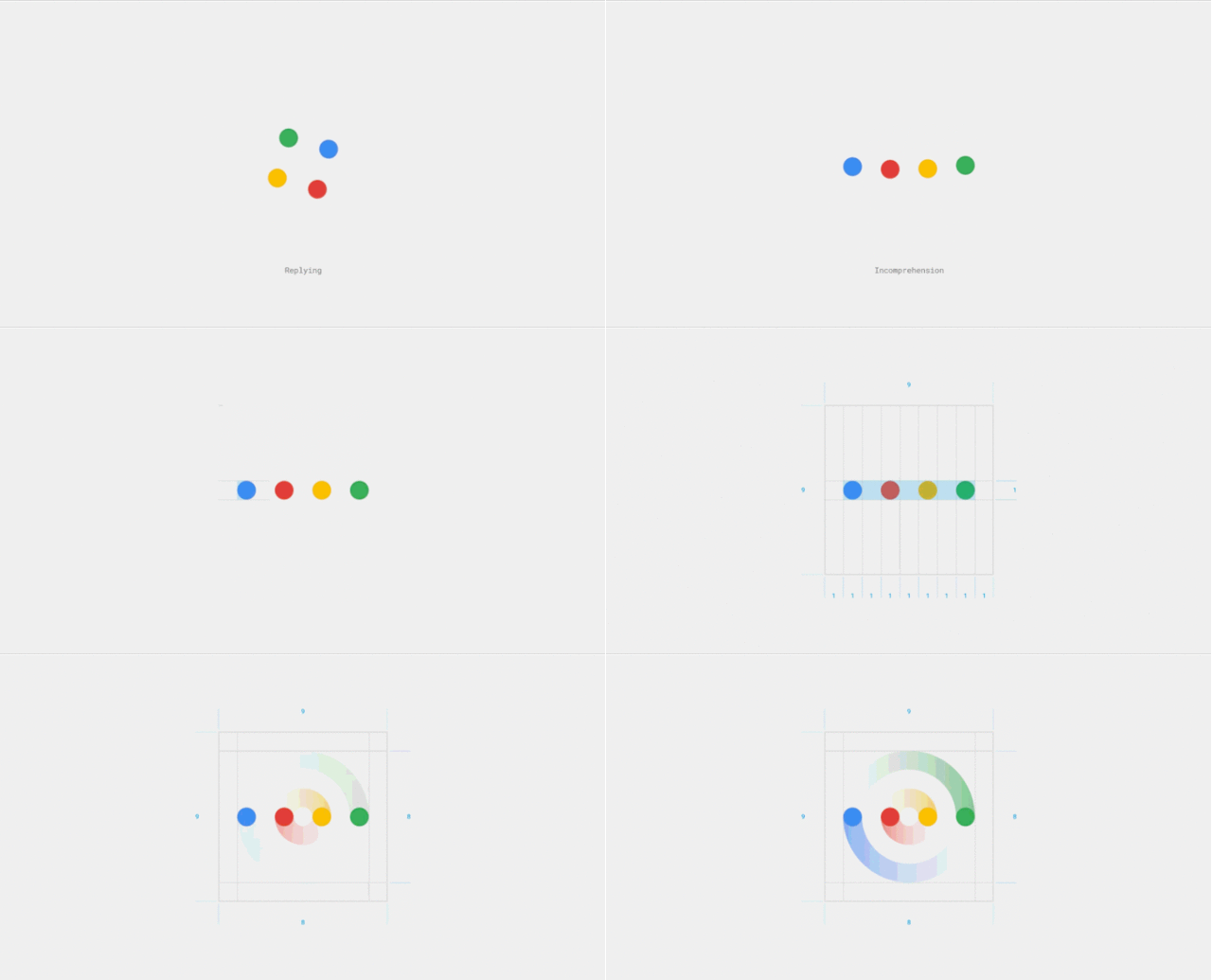
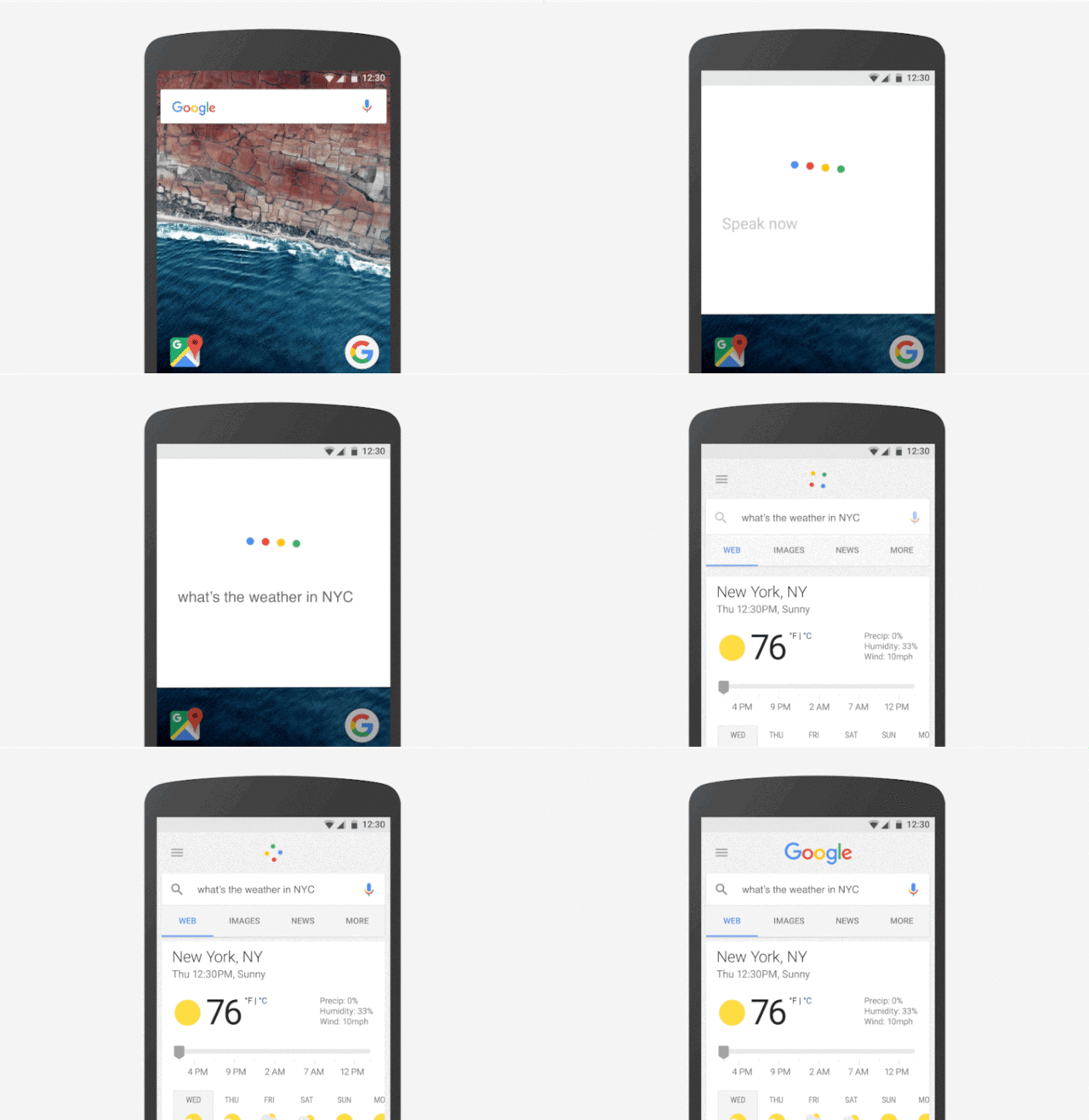
Google revealed a new logo yesterday, and in our book, it’s pretty great. With a smoother, sans serif typeface, it’s built to shrink legibly to fit the smallest screens. But the bigger story is its animated interaction language—the fact that it can morph into a series of dots that can convey anything from “Google is listening” to “Google is searching for nearby ice cream.”
But we wanted to know what the industry at large thought of the update. So we asked some of the most elite names in design and branding what they thought of Google’s first new logo in 16 years.
GEOFF COOK AND MIN LEW, PARTNERS, BASE DESIGN
“What is clear is that the new identity is not about a logo but rather a smart system–a visual language–that enables us, the users, to connect the dots across the Google ecosystem. With the advent of Alphabet and the promotion of Sundar to CEO, Google now stands for product, and the new visual language will make for a more seamless experience from desktop to mobile.
What is fascinating is the way in which Google launched the new identity. Every move was coherent with the Google’s personality, with equal parts simplicity & clarity (through their rational explanation on their initial blog post) and color & humor (the erasing of the old logo on the search site). Their actions are in keeping with the brand and moreover, consistent with the way people converse in the digital and social space. These actions, as opposed to a more “corporate announcement,” will help Google to have the identity be more readily adopted by the public.
Most of all, the evolution of the identity signifies that Google embraces change. Design at its core is about function, and with this purposeful identity system, Google is putting a stake in the ground that they are about design first, a mindset that will reinforce the brand and position them well in the years to come.”
Verdict: “Hit for sure. Chart topper. +1 in bold, 60 pt type.”
TOM WASON, GLOBAL PRINCIPAL, WOLFF OLINS
“Google is one of the few companies in the world that’s been deliberately de-digitalizing over the last few years. It’s been creating (and acquiring) products that manifest mostly in the physical world. With the restructure to Alphabet, what’s left as part of the Google brand is now freed up to be more purely digital and mobile.
A 305 byte logo is pure Google. Despite bandwidth increasing in developed countries to the point where it no longer seems to matter, being super accessible on poor mobile data connections is critical to brands that hope to touch billions. These forms are so much better for the mobile world: the logotype and particularly the uppercase G are scalable down to the tiniest spaces. Easier said than done whilst still remaining distinctive.
The pick of the work is the motion. So much meaning into so few elements. It shows that something designed for pure utility can also burst with character. Love it.”
Verdict: Hit. “For the motion.”
MADS JAKOB POULSEN, CREATIVE DIRECTOR, SIEGEL+GALE
“I worked a bit on exploring a simpler Google identity a couple of years ago so I am very familiar with the exploration the team must have gone through. This redesign makes total sense and seems as a natural evolution of the Google visual identity. Maybe too natural though . . .
The result definitely is an improvement from a design standpoint. It is cleaner and more modern using a custom sans serif instead of the the old quirky serif typeface. My one complaint is that the typeface is so friendly that it, with the primary colors, looks almost child like. The old serif added some gravitas which you could argue one of the world’s biggest brands does need.
The new logo is (and maybe should be) extremely Googly and I could see a need for logo versions in just one color for premium products such as Google Glass, Google cars etc. A more mature version of the logo if you will. A crisper wordmark would also have helped achieve a less naive look.
The four dots have great potential to become a signifier of you being in a Google environment, without the need to use the Google wordmark or the shorthand four-colored G. They can animate to guide you through interfaces, suggest actions and even moods, add some personality via their reaction to your interactions.
It will definitely be interesting to see things evolve within this new Google identity.”
Verdict: “Hit on overall design improvements. Miss for missed opportunity to truly impress with the usual (mindblowing) Google innovation.”
MICHAEL ROCK, FOUNDING PARTNER AND CREATIVE DIRECTOR, 2X4
“The only-thing engineers love more than Escher prints are primary colors, perhaps they appeal to their sense of reductive order. Google has always packaged its unfathomably complex, world-dominating operation in a cutesy wrapper of bright tones and charming cartoons. The awkward naiveté of the past logo iteration—novelty serif font in Lifesaver™ hues—has now been re-imagined in full Montessori: even rendering the inaugural appearance in crayonimation. In case you miss the pre-school reference, the rotated lowercase “e” of the new sans serif version hammers the point home with a needlessly obvious wink.”
Verdict: Hit

CONNIE BIRDSALL, SENIOR PARTNER, CREATIVE DIRECTOR, LIPPINCOTT
“Google’s new logo is elegantly simple but still maintains the fun and playful quality of the original design. It speaks to the future potential as well as the current functionalities of the Google brand. The four dots are really beautifully choreographed to communicate with us “human beings”—it is actually pretty magical and 100% universal. The design and precise craftsmanship show a great depth of intelligence and restraint not typical of these types of evolutionary programs. Super well done.”
Verdict: Hit
STEVE HELLER, JOURNALIST AND FORMER ART DIRECTOR AT THE NEW YORK TIMES
“Google’s new logo is a homerun. They’ve managed to take the three often conflicting attributes of logo design—the letter, the word and the image and turn them into a joyful, memorable modern expression of their brand. Some might say the animation is a bell and whistle, I say it is an evocation of contemporary media.”
Verdict: Big hit
JON HEWITT, CREATIVE DIRECTOR, MOVING BRANDS
“It’s a bit childish. But so was the old Google logo. It does feel more coherent, aligning to both the visual direction Google has been pushing towards in recent times, and to their new holding company Alphabet.
The way it behaves in animations and transitions is great though. A moving brand—where the logo is more than an identifier, and becomes a guide that helps you understand the user interface.”
Verdict: “Hit on the motion style, Miss on the static mark.”
DAVE TUPPER, CREATIVE DIRECTOR, HUGE
“The new Google logo is a smart, modern take on its predecessor. In typical Google fashion, the thinking behind this redesign is beyond trend and style; it’s rooted in functionality and practicality. They’ve stayed true to the Google brand in color, form and friendliness, but pushed it further to work seamlessly across a variety of formats making it easier to read, use and most importantly, embrace the success of brand-into-vocabulary by creating a multi-use design system that functions like an infographic.”
Verdict: Hit
TOBIAS FRERE-JONES, FOUNDER, FRERE-JONES TYPE
“It’s well made for the most part. I can see that they wanted to retain the tilted-back ‘e’ from the previous logo, perhaps for a sense of continuity. But the old logo had a calligraphic origin, building every curve on a titled axis. Without that supporting context in the rest of the word, this ‘e’ looks forced. To be fair though, I don’t think there’s any way to get that shape to look good in a geometric design. They really should have left this detail behind and made it all straightforward, to deliver these colors because that’s where Google’s identity lives.”
Verdict: “Can you put me down for ‘mixed’?”
ANDREW WILCOX, SENIOR CREATIVE, DROGA5
There was a nostalgic charm to their previous logo, but not in an iconic sense. No one thought it was an amazing logo. And I don’t think anyone can legitimately be “up in arms” over the redesign. It’s still charming. Still rudimentary. It’s not cool, which is perfect, because Google is not trying to be cool. Its circular anatomy will make it endlessly adaptable to various iterations. I like the imperfect tilt of the “e” on the end. Keeps it light.
Verdict: “I’ll say it’s a hit.”
MICHAEL BEIRUT, PARTNER, PENTAGRAM
“I’ve declared a temporary moratorium on commenting on new logos in the press. I find that my first impressions are too often superseded.”
Verdict: TBD (or maybe a hit?)

