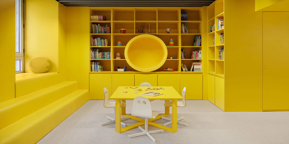
One of Portugal’s biggest hospitals has a new Pediatric ward, and it’s all about color.
Hospital design has changed drastically over the last century. Once considered a house of death that provided only basic facilities for the sick and dying, hospitals have grown to become places of healing—with restorative architecture to match.
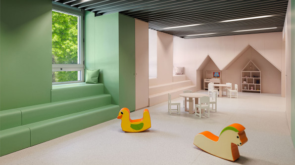
One recent example of this evolution comes from the Portuguese city of Porto, where one of the country’s largest hospitals, Hospital de São João, opened a new pediatric ward in 2020. As part of the new ward, the hospital commissioned a local architecture studio to design a leisure area for young patients who have to spend extended periods in the hospital and need a place to read, play, and learn.
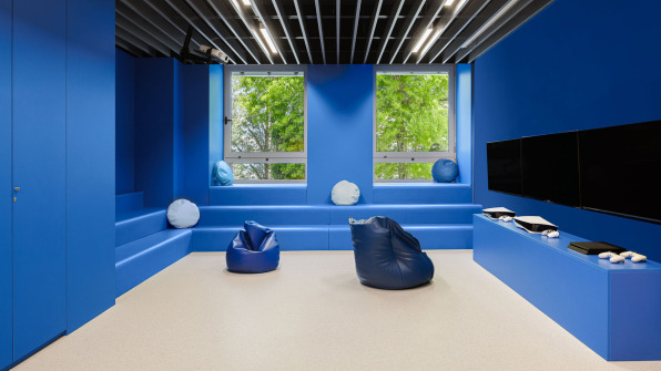
The new area opened in January 2022, to a design by ARG studio. Located on the ground floor of the six-story hospital, it is split across five main rooms, each with their own color identity, like a warm yellow for the library, or as soft pink for the play area. It’s a humble project that barely looks like a hospital, but it speaks to the evolution of healthcare design, where spaces are increasingly designed to support patients’ physical and mental well-being.
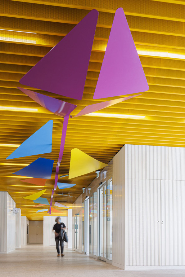
The journey beings right at the entrance of the ward, where visitors walk in under a bright yellow ceiling made of slatted panels. Here, the architects collaborated with illustrator and designer Francisca Ramalho, who created a piece of artwork shaped like a flying kite to symbolize the idea of “getting away,” says Ricardo Guedes, the lead architect and founder of ARG studio. The artwork continues in the form of wall murals throughout the ward, and an accordion-shaped wall along one corridor.
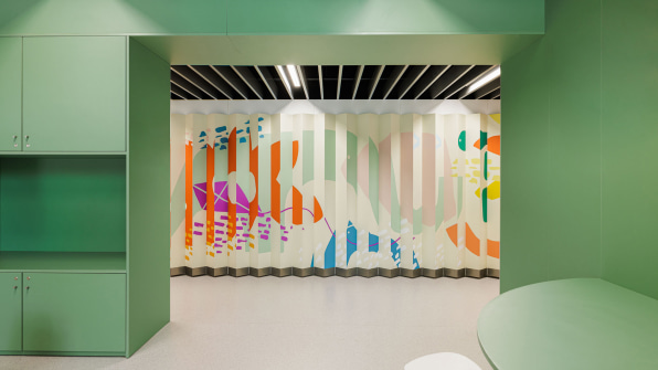
For the leisure area, the architects provided a variety of experiences for the patients, who range from young kids to teens. A notable feature in each room is a stepped bench that turns into a window sill at the top, where kids and teens alike can sit and be on their own. “The bench was like a soft transition from the communal spaces to the introspective spaces,” says Guedes.
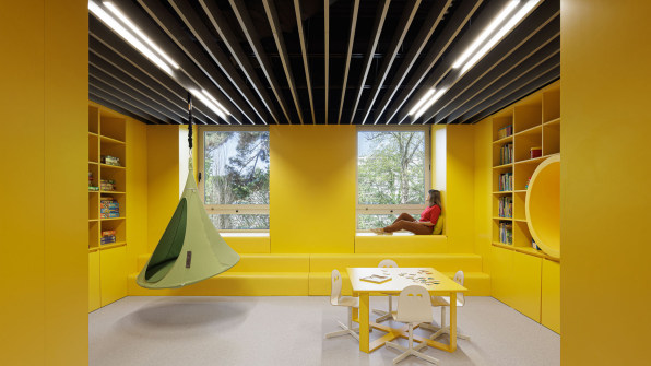
The space is undeniably designed for kids, but Guedes believes the underlying vision intent could translate to hospital design more broadly: “Everyone will face moments of healthcare despair or stress, and we need to find a way to calm people by designing space and color and light,” he says.
—
This article first appeared www.fastcompany.com
Seeking to build and grow your brand using the force of consumer insight, strategic foresight, creative disruption and technology prowess? Talk to us at +971 50 6254340 or engage@groupisd.com or visit www.groupisd.com/story

