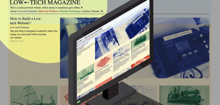
Low-Tech Magazine’s new website is solar-powered, which means it goes offline in cloudy weather.
The internet is a system that demands more: more engagement, more clicks, more ads, more content, more code, more servers, and more devices. The size of a typical web page has increased exponentially in recent years. Thirty-nine percent of young Americans report they are online “almost constantly.” Today almost 20% of American households contain more than 10 internet-connected devices, which have their own associated energy costs. By 2025, the internet will account for 20% of the energy consumed on the planet.
Last month, Low-Tech Magazine quietly published a completely redesigned site for its technology- and energy-focused journalism that looks radical by comparison. The premise is simple: Less.
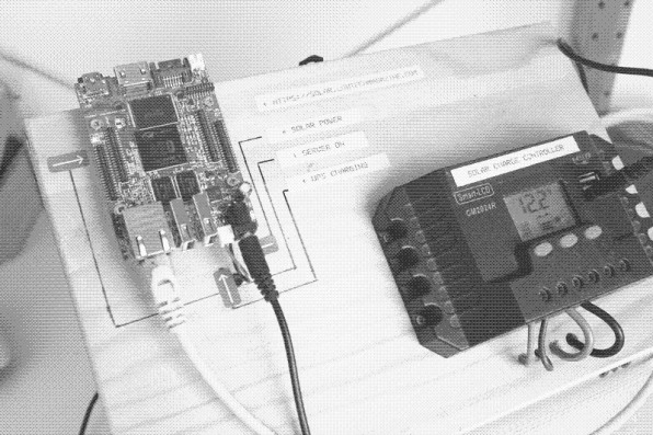
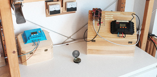
Unlike millions of other dynamic sites on the internet today that retrieve each piece of content from a database any time someone visits, Low-Tech’s solar-powered site is simply static documents stored on a single, self-hosted server.
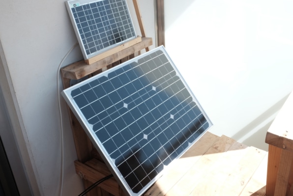
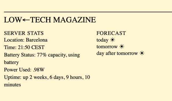
That server is powered by a small photovoltaic array on founder Kris De Decker’s balcony in Barcelona, which keeps the site online when it’s sunny. If it’s cloudy for more than a day or two, Low-Tech goes offline. A battery icon on each article shows how much juice the server has left and the forecast (sunny and 83%, at the moment).
There are no ads or pop-up dialogs, and images are compressed to a bare minimum. The logo is a unicode symbol and the typeface is your browser default, which means your computer doesn’t have to query a server. All in all, the average page size is five times smaller than the old site.It’s a radical departure from the digital design of today, where more videos and dynamic features have made web pages heavier and heavier. But the new site isn’t a Ludditical argument for the return of 1990s-era internet. It’s more like a reminder that our internet has weight–and everyone, from developers and designers to writers and readers–contributes to it.
“We used to [only]be online when we were at a desktop computer with an internet connection,” De Decker says. “But now this limitation is gone, so we’re online from the moment we wake up to the moment we fall asleep.”
Have you ever thought about how much energy it takes to refresh your Instagram while you’re lying in bed? Be honest. The premise of Low-Tech’s redesign is simple: We should be thinking about it.
The new site is the result of two summers of collaboration with artist Roel Roscam Abbing and designers Marie Otsuka. and Lauren Traugott-Campbell, who received a grant while at RISD to work with De Decker on developing a low-energy platform and content management system for the magazine. Otsuka, now graduated and working as a type designer, wanted the the site to expose its own infrastructure.
“This approach is very specific to Low-Tech, but I do think it’s really important to understand all the parts that go into a website–in addition to the look and feel on the front-end, the infrastructure on the back-end,” she explains. “What the design is aiming to do is show that relationship, and have the infrastructure of the website also be part of the content of the website.”
For instance, they decided to compress every image on the site with dithering, a long-outdated form of compression that was popular in the 1990s:
Dithering makes images 10 times less resource-intensive–but that’s not the only reason they chose it. When the magazine relaunched, commenters pointed out that newer types of image compression could’ve achieved the same savings without changing the look of photos so much. But that wouldn’t broadcast the goal of the design in the same way to readers. “We wanted to highlight this act of compression that’s something we don’t always think about when we’re surfing the web,” Otsuka explains.The same logic led to the battery meter that accompanies the reader around the site. “It’s the most controversial part of the design–some people really hate it,” De Decker says. “But I think we’ll keep it, because it shows the reader that what you’re doing now consumes energy; depending on how many articles you read, it’s going to go down.”
The team estimates that the site will be offline about 35 days per year or about 10% of the time–another design feature that some critics, unsurprisingly, saw as a glitch. In fact, when commenters pointed out that it would be simple to use multiple servers to keep the site online on cloudy days, Roel Roscam Abbing, the Dutch artist who focused on the new site’s hardware, responded by explaining how the weather is fundamental to the design.“We are aware that we could make multiple servers around the world to always have the sun shining and use clever routing to always have the machine online,” he wrote. “In the case of our server it is fairly simple to have a 90% uptime with a cheap and energy efficient computer and a small solar panel. However, to go above that 90% we would need to double or triple the machines used, the solar panels necessary and our storage capacity available. That is not even mentioning the resources necessary to maintain all of this in different parts of the world. If this is to work in a sustainable way, we have to change our attitude and the best way to do that in terms of web is to challenge the holy grail of ‘uptime.’”
Otsuka points to Jevons’ paradox, an economic theory that states that if you become more efficient at using a particular resource, you don’t end up using less of it. Instead, you use more–because of increased demand. In other words, the goal isn’t to make today’s typically heavy web design more efficient. It’s to reduce its energy consumption overall. Or, as Roscam Abbing puts it on the site’s open source guide to low-tech design, “Not in order to be able to ‘do more with the same,’ but rather ‘to do the same with less.’”
What makes the idea so powerful is that, by reducing the energy footprint of the site, the design also subtly improves the experience of the person reading it. Because it has no ads, relying instead on Patreon donors, the site has no cookies or third-party content to track visitors. It doesn’t profile readers. There are no pop-up boxes or dark patterns. Because it exists as a static site, each page downloads 10 times faster. The fact that it won’t be available sometimes forces readers to “plan” when they will access its content around the weather and the time of day, rather than deluging them with it at all hours.
The design nudges readers to consume less energy, which means altering our behavior and being a little more thoughtful about the information we consume. It makes the internet feel like a finite resource: Rather than begging us to click, it asks us to only click when we need to. Do you really need that extra tab?
–
This article first appeared in www.fastcompany.com
Seeking to build and grow your brand using the force of consumer insight, strategic foresight, creative disruption and technology prowess? Talk to us at +9714 3867728 or mail: info@groupisd.com or visit www.groupisd.com

