Look at Steve Harvey’s Card – He Was Set up to Fail
Steve Harvey messed up big time.
The Miss Universe pageant was down to the last two contestants and he crowned the wrong winner, leading to one of the most awkward moments I’ve seen on TV, on par with the cringeworthiness of Ms. South Carolina’s answer in the 2007 Miss Teen USA Pageant. Such as.
But as more information comes out, I’m starting to think that Steve here was set up to fail with bad design and it wasn’t entirely his fault even though the internet seems to feel otherwise.
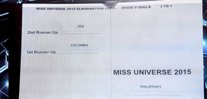
JUST LOOK AT THIS TWEET OF HIS REFERENCE CARD:
ICYMI: Here's the card Steve Harvey got handed & announced Miss Colombia as the winner pic.twitter.com/VlGMms6mfl
— Darren Rovell (@darrenrovell) December 21, 2015
What do you see on first glance? I got a blank postcard addressed to Miss Universe 2015– a whole lot of negative space.
While simplicity can be good for maintaining clean, deliberate design, it should always take a back seat to functionality. Art can get away with it because it elicits personal emotion juxtaposing our own experience with the collective consciousness of societal norms. And private parts.
But if this card has one single task, to inform the host of the winners and losers, the only thing that matters is that the necessary information gets across as quickly and easily as possible. Steve needs to know who lost, who got second, and who won. That’s it. Everything else is superfluous since, assuming there’s no royal disaster, literally only 5 people will ever see that side of the card.
What the card should’ve looked like
First off, I gotta say the whole 2nd runner up and 1st runner up is unnecessarily complicated. It’s like ordering a coffee at Starbucks. Can’t we just say small, medium, and large instead of first loser and second loser?
Get rid of that “runner up” repetition and make it clear who won, lost, and hit the depression jackpot (according to psychology the Silver medalists are the least happy because they almost won).
But more important than the terminology is the font size and positioning of the information. Here’s the card Steve was given:

Assuming the you have full access to card’s entire area, let’s see how much space is occupied by the important information.

That’s where the contestant’s placement and associated country goes. When compared to the overall area of the card, these highlighted boxes account for only 5.8% of the available room. While unquestionably minimal and clean, there’s a lot of room leftover for activities.
So increase the font size, got it. The other consideration that could lead to confusion is the positioning of information on the card itself.
The title at the top is fine– it’s useful to make sure it’s the right pageant, year, and stage of the competition. But why does it jump from the top left quadrant to the bottom right? Aesthetically it would look nice if there were accompanying pictures but, again, thinking about functionality, there’s no reason why the eye should have to make that leap especially considering how damn small the country names are printed.
HERE ARE TWO OPTIONS FOR BETTER LAYOUTS:
Option 1 follows a logical reading path (left to right, top to bottom) and you can read those country names all the way from Timbuktu.

Option 2 gets a little fancy with the positioning but the text is a lot easier to read, the arrow makes it like a fun little game, and there’s even a friendly reminder for the host to pay a bit more attention when announcing the winner!
These are 2 out of infinite designs you can play around with for readability but the results are the same: the crucial information in both of my suggestions takes up more of the surface area (15%) and is positioned logically.
Try to keep design in mind
Design matters but it’s easy to dismiss it by comparing it to putting “lipstick on a pig” or the inevitable “just look at Craigslist.” A middle ground will always exist between form and function and rarely do you want to go to either extreme. Like with most things in life, moderation goes a long ways.
Steve here got a rude reminder of Murphy’s Law so, even if you think something is absolutely foolproof, you can always hedge your bet by considering your design from a complete stranger’s perspective.
Take a step back, identify the purpose, highlight the core information, and then try to make it look like you put in a little effort.
Like double checking the spelling– eliminination? Really?

