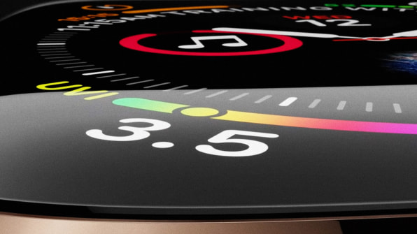
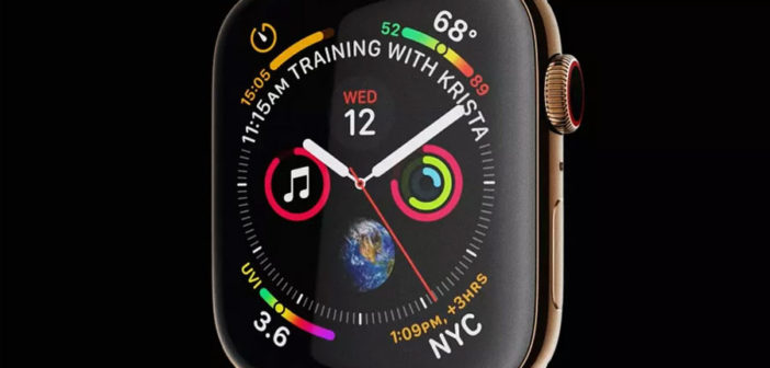
Take a look. Soak it in. This is the new face of the Apple Watch 4, running WatchOS 5, announced on stage today in Cupertino.
It’s a nightmare of information density. It features seven slider graphics. Seven. Some denote temperature. Some track steps. Another lets you know your Kesha track is almost over. There’s a graph for that. The face also features the Earth, because, I guess, there was a spare round spot for an extra affordance. And it features an alert in all caps where the dial would be–11:15AM TRAINING WITH KRISTA. Somehow, I actually didn’t notice this notification for the first few minutes, during which I was staring at this interface in disbelief.

How is this the hero shot, Apple? The color scheme isn’t unified. Numbers are presented through oft-incongruous infographic values. The good news is you can customize the face, and third parties like Nike reimagine it entirely. But this mess of a screen is an insult to the user’s cognitive load. Apple products are traditionally paired down, offering you just enough of the right information at the right time so they don’t tax your brain unnecessarily. Compare this to the iPhone’s spartan lock screen, which is already much larger. This watch face refuses to make any decisions for you, instead throwing every piece of information you might want at you, ultimately distracting you from what you care about and forcing you to spend mental energy to mute out the noise.

The Apple Watch 4, with handy new technologies like an FDA-approved ECG and fall sensor, could be incredibly powerful in medical monitoring–especially for the elderly. But grandma will have to wade her way through the pixel puke, first.
–
This article first appeared in www.fastcompany.com
Seeking to build and grow your brand using the force of consumer insight, strategic foresight, creative disruption and technology prowess? Talk to us at +9714 3867728 or mail: info@groupisd.com or visit www.groupisd.com

