The newspaper studied readers and prototyped extensively to find better ways to surface news and analysis.
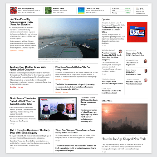
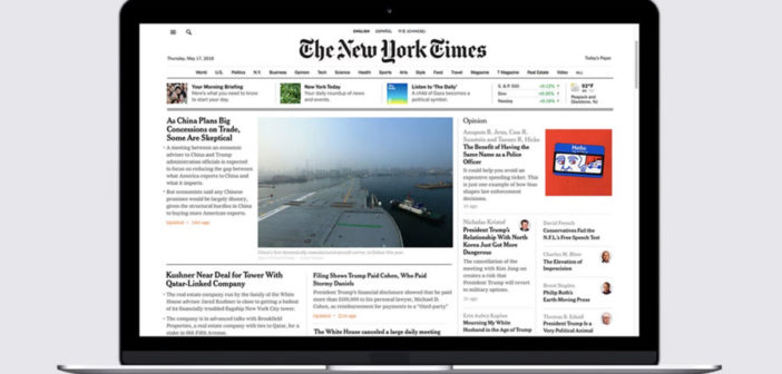
The New York Times is rolling out a new homepage, one that will show off the staples of its digital journalism: its briefings, the audio newscast “The Daily,” newsletters, and groups of stories that editors have chosen.
The central goal of the redesign was to bring the Times’s desktop experience in line with its suite of mobile apps, which were updated in October of last year. But it was also to understand how people like to read their news in 2018. To find out, the design team talked to 40 readers in New York, Los Angeles, and Houston and asked them questions such as, “How do you start your day?” and “What helps you stay up to speed on current events?” The design is a reaction to these people’s main answers: They come to the Times to catch up on news, of course–but they also want to hear analysis of major events and discover unexpected stories (perhaps to brighten their days after reading about national politics).
The challenge for the designers was to implement a system that would actually help people find what they were looking for on the homepage. The prototyping process was extensive. The team tested out real-time prototypes with 4% of readers and got 15,300 survey responses before doing more in-depth sessions with about 60 people. Some concepts had less text, which in theory would encourage scrolling, but readers didn’t like how empty those designs felt. Other layouts had too many photos–the team realized that images of politicians in suits get boring and repetitive, so those were downsized a bit. Eventually, they settled on a new homepage that still packs a lot of information onto your screen, but also breaks out into sections such as “Most Popular,” “Discovery,” “Features,” and “In other news,” which highlights stories not focused on the United States.

While the redesign was focused on making it easier for readers to find stories, it also simplified the process of actually running the homepage for the newspaper’s editors. To understand this piece of their task, the paper’s designers sat with the homepage editors for a full day, watching how they worked as news broke. They ended up building a backend tool for the editors so that they could group related stories in a wide variety of formats together on the homepage.
In a world dominated by social media, the paper of record clearly still believes that its homepage, the digital equivalent of A1, plays a role in delivering its journalism effectively. But this is also the last piece of a larger redesign that’s been happening behind the scenes over the past several years–it’s no surprise that the Times prioritized its mobile apps and is only now getting to the homepage.
Still, the redesign is a gesture of strength for a news organization that continues to grow during a shaky period for media. The Times brought in more than $1 billion in subscription revenues in 2017. The paper has 2.9 million digital subscribers.
The Times will start rolling out the new homepage over the next few weeks.
–
This article first appeared in www.fastcompany.com
Seeking to build and grow your brand using the force of consumer insight, strategic foresight, creative disruption and technology prowess? Talk to us at +9714 3867728 or mail: info@groupisd.com or visit www.groupisd.com


![[Screenshot: courtesy The New York Times]](https://images.fastcompany.net/image/upload/w_562)