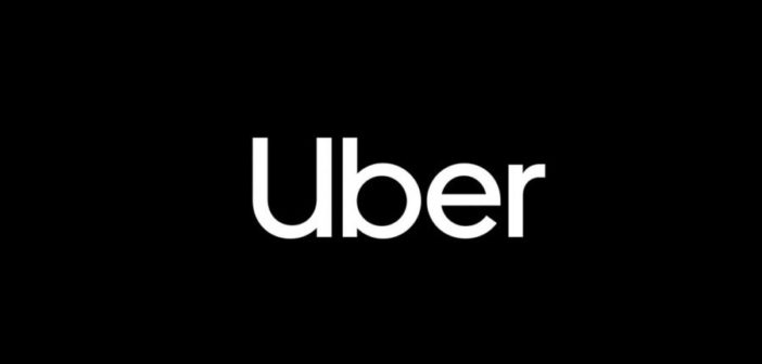
Uber rebrands less than two years after its last effort
Ride-hailing app Uber’s attempts to improve its public image have now extended to yet another full rebrand of the business, including a new logo which ditches the all-caps look for a simple ‘Uber’ written in a custom-designed typeface.
The clean new appearance seeks to place past travails firmly in Uber’s wing mirror and will sprout everywhere that the Uber icon currently appears such as its Twitter account, website and mobile app.
To harmonise its estate of Uber will also rebadge its Uber Eats division with the same lower-case look in the Uber Move font, championing the capitalised ‘U’ to signify the business at a glance while retaining the familiar jet-black backdrop.
It last rebranded in February 2016 to show it is a “fundamentally different company”. Now it appears to be doing that again. Below is the old branding.

In a statement, an Uber spokesperson told Mashable: “We’re excited to unveil a new, simplified logo for the Uber app that brings back the U, is easily recognizable, and is scalable across the 660 plus cities we serve.”
Uber’s new look also reflects a desire for it to be known as a ‘platform of mobility’ by ending current confusion sown by a symbol on the current Uber app which most customers fail to associate with the firm.
The redesign process took nine months to conclude and was aided by brand consultancy Wolff Olins together with type foundry MCKL.
Earlier this summer Uber appointed its first chief privacy officer as it continued efforts to clean up its brand.
Source:
–
This article first appeared in www.thedrum.com
Seeking to build and grow your brand using the force of consumer insight, strategic foresight, creative disruption and technology prowess? Talk to us at +9714 3867728 or mail: info@groupisd.com or visit www.groupisd.com


