Ask 100 B2B event organizers how to execute effective event design, and you’ll get 100 different answers.
So to get to the truth we at Splash analyzed 37 design-related metrics for the highest-performing virtual and in-person event websites from August 2019 to August 2020.
If you haven’t thought about B2B event design before, I don’t blame you. Sometimes it seems like an afterthought—even to event organizers. We’ve all seen the heavily templated event websites and uninspiring emails that scream, I’m not focused on design; I’m dealing with the big stuff that can determine the outcome of my event.
Sure, attracting the right attendees and developing compelling event content (among other things) should be priorities. But event design can significantly affect the quality, registration rate, and overall success of B2B events more than you might think.
That’s particularly true in an environment still dominated by virtual events, where site design and branding are on full display for the duration of the event.
A full 46% of companies anticipate hosting more virtual events in 2022 than they did in 2021, our research has found, even as in-person events begin their comeback. And that means digital event design will be an essential skill for B2B event professionals to master.
So, what is the “secret sauce” of effective event design?
The most successful events adhere to specific design principles and best-practices designed to encourage clear communication, consistency, and engagement, our research found.
More specifically, the most in-demand B2B events made great use of the following five ingredients.
1. Clear Calls to Action
An event website’s most important job is to drive registrations. Eye-catching visuals, headlines that pique readers’ interest, content that clearly communicates what to expect—those are all intended to get the right people to sign up for an event.
Powerful event design captures the viewer’s attention and then uses a call to action to immediately direct that attention to event registration.
Tip: Well-designed event websites place registration buttons in the first block and keep all signup forms in line with page content rather than linked to a separate page. On successful virtual-event pages, first-time invitees encountered a registration button in the first content block 77.1% of the time; successful virtual-event sites also used inline forms 22.9% of the time, which is almost three times more common than for in-person events.
2. Standout Titles and Headlines
On a virtual-event website, the page layout creates a visual hierarchy that helps users navigate their experience cohesively and helps to differentiate among levels of information (theme and keynote speaker: critical information. Parking directions? Not so much).
Titles and headlines—and their relationship to body copy—play an important role. They should be the most prominent text elements, well-distinguished from other text, and they should communicate the most valuable information.
In our analysis of successful virtual events built on Splash, the ratio of title font size to median body copy ranged from 2.8:1 to 3.5:1. Font size relationships in that range created effective contrast and enabled more streamlined information delivery.
In addition to contrasting text size, high-performing websites’ headline and title content tends to be clear and action-oriented and reinforces the event theme. Just as the typography and page layout should be designed toward encouraging specific actions, so should the words and phrases themselves.
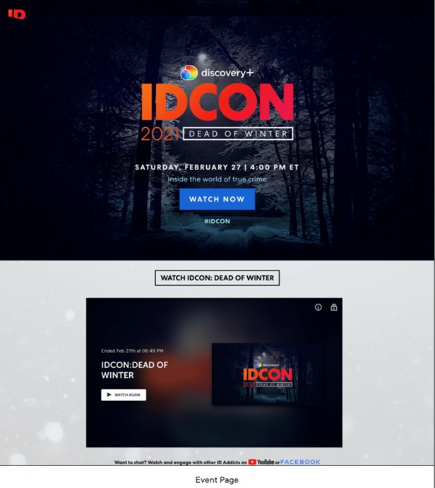
Example 1: Discovery+ created an event page with contrasting text size, reinforcing the event theme for IDCON.

3. ‘KISS’-able content
We all know the guiding mantra of digital content: keep it short and simple. Successful virtual B2B event design embraces that principle, conveying event information in the most straightforward way possible.
The most effective virtual-event pages have an average of 5.8 content blocks or sections, compared with 7.2 for the most effective in-person events, our research found. More than 6 content blocks per virtual-event page had a negative impact on research results.
4. Color Contrast
In Web design, the contrast between a website’s foreground and background is always important for ensuring legibility. Our research bears that out: 88.5% of successful virtual-event pages and 76.8% of successful in-person event pages used primarily white backgrounds with black or dark grey body copy. White backgrounds are strongly correlated with high performance on virtual-event sites.
We also found that registration buttons that strongly contrast with the background but are distinct from headlines and text are optimal for encouraging signups and providing an accessible visual experience.
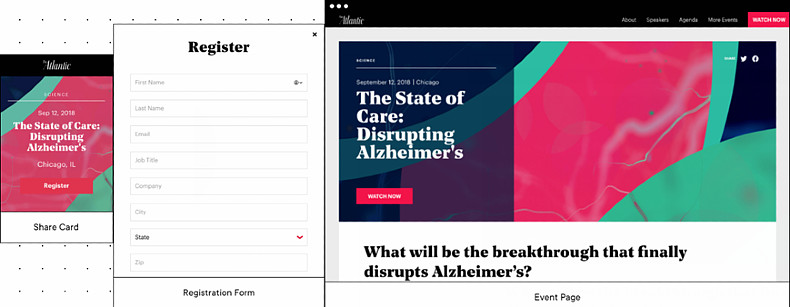
Example 2: The Atlantic created its The State of Care: Disrupting Alzheimer’s event page, which included a registration form, share card, and agenda that were all on brand and visually appealing.

5. Consistency and Replicability Across All Channels and the Brand
A crucial element of effective B2B-event design is ensuring all assets—including the website, invitations, and reminder emails—are consistent in branding and design. That creates a cohesive experience for potential registrants and attendees.
But the best event designers recognize that such consistency should extend to other events across the organization. Having the technology and tools to replicate effective event design will maximize attendance and lead to better business outcomes for all events, not just a single showcase gathering.
…
This article first appeared in www.marketingprofs.com
Seeking to build and grow your brand using the force of consumer insight, strategic foresight, creative disruption and technology prowess? Talk to us at +971 50 6254340 or mail: engage@groupisd.com or visit www.groupisd.com/story


