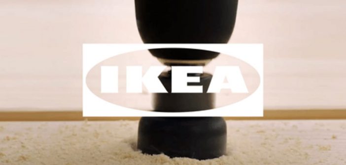
The company isn’t giving up its blue and yellow logo, but it instead will debut a white branding scheme that can sit on top of any image or video. It’s all part of Ikea’s move toward digital.
Ikea has had the same instantly recognizable logo since the 1960s, with big blue block letters nestled inside a yellow oval that sits inside a blue box. But today, Ikea is announcing a change designed to help the company communicate more effectively as it scales up its digital presence.
The shift is subtle by design; because Ikea is so large and its logo is so well known, a radical change in branding would work against the aim of strengthening the company’s online brand. Instead, the company opted for the window design because it’s flexible enough to function across every digital platform Ikea uses to reach consumers, and could adapt to any future image-based platforms as well.
The dynamic logo was designed by the creative agency 72andSunny Amsterdam, which wanted to create a flexible tool to help people connect more emotionally with the brand online by underlaying photography and videos of people assembling and using Ikea products beneath the new all-white logo. While it’s a clever branding update, the design also points to a broader shift at Ikea, which is shaking up its entire business model.
In Ikea’s 2017 to 2018 financial year, 957 million people visited Ikea’s 422 stores around the world. But 2.5 billion people visited its website. Ikea is adapting to the age of e-commerce by launching a host of experimental apps that utilize AR and VR to help people shop virtually, and debuting smaller urban stores that act only as showrooms where shoppers order everything online (the first one just opened in Manhattan).
It’s part of the company’s transition away from big-box stores and the traditional Ikea shopping experience, which in many ways feels outdated for younger urbanites looking to buy furniture: Ikea stores are usually located in suburbs and require a car to access and take home the products you buy. Still, the company has a long way to go, with shipping prices that may be too high for people used to the free convenience of Amazon Prime.
“Many people meet Ikea only through their phones,” says Åsa Nordin, the identity and symbols leader at Inter Ikea Systems, the company that oversees Ikea franchises and trademarks. “Not everyone is going to our big boxes, which are a strong identity for Ikea . . . how people meet brands is much more dependent on how we appear in a digital space.”
The design process took two years, and is the direct result of feedback from Ikea stores around the world, Nordin says. She learned that franchise owners find that while an Ikea big-box store delivers a branded experience unlike any other, that wasn’t the case online. “We could see a clear need to have much stronger brand recognition and also [express]our brand personality in a stronger way,” she says.
The Fönster logo is part of this larger move to support Ikea stores digitally. The first step in the branding refresh was to subtly revise the blue-and-yellow logo itself so that it would be legible on small screens, a change that the company debuted earlier this year, as Co.Design reported. The Fönster takes that idea to its logical conclusion by creating a digitally native version of the logo that can morph to fit whatever digital scenario might arise.At the moment, one of the primary use cases is for social media. Instead of slapping a logo on the corner of an Instagram story, for instance, Ikea’s social media managers will now be able to integrate the logo into their content more naturally. It can also act like a transition animation, or give designers a way to artfully add a secondary image within the larger image.
“You can use it to deliver further information or make people pay attention to a detail,” says Carlo Cavallone, the executive creative director at 72andSunny. “And then it becomes a way to continue to remind people of the brand in a situation online where we are easily distracted and we encounter millions of images.”
It’s a simple idea, but the Fönster system’s ability to adapt to many digital situations could serve Ikea well as the company expands its traditional big-box footprint through its website, app, and smaller urban stores where shopping online is a core part of the experience.
–
This article first appeared in www.fastcompany.com
Seeking to build and grow your brand using the force of consumer insight, strategic foresight, creative disruption and technology prowess? Talk to us at +9714 3867728 or mail: info@groupisd.com or visit www.groupisd.com


