![[Image: Emanuele Abrate]](https://images.fastcompany.net/image/upload/w_562)
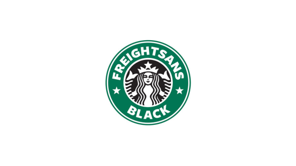
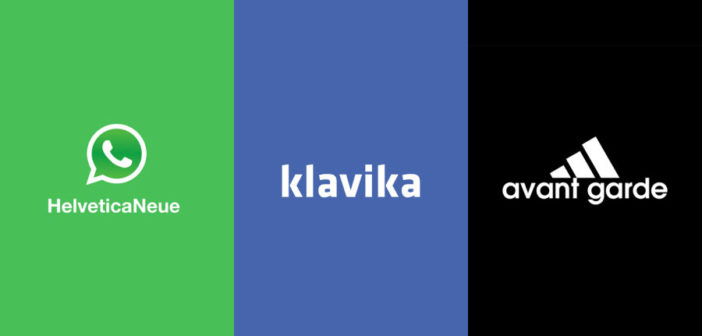
Logo and identity designer Emanuele Abrate recently conducted a very curious experiment. He decided to recreate some of the most famous logos on earth–from Adidas to Red Bull–by replacing each brand name with the typeface used in each logo. Put down your Freight Sans Blackfrappuccino and ponder the results above.

I asked Abrate–who is also a teacher and managing partner at Italian blog and academy Grafigata–how the idea came to be. It turns out, it emerged from a very common question among design fans, including myself: What’s that typeface? “Every time I see a logo,” Enmanuel told me, “I wonder how it was conceived, how it was designed, what kind of typeface was used and why.” He decided to turn his analysis into a graphic project that illustrates how important typography is to these iconic logos.When I look at some of his mock-ups, I don’t even notice the brand name is missing. Bebas Neue is still obviously Netflix. Klavika is obviously Facebook. My brain is so trained by the context of the logo mark, the color, and the typeface itself, that the “Futura” above the Nike Swoosh logo doesn’t even register as out of place.
–
Images: Emanuele Abrate
This article first appeared in www.fastcompany.com
Seeking to build and grow your brand using the force of consumer insight, strategic foresight, creative disruption and technology prowess? Talk to us at +9714 3867728 or mail: info@groupisd.com or visit www.groupisd.com


