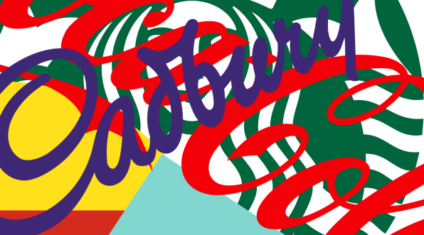
Coke. McDonald’s. Cadbury. Starbucks.
In the hypercompetitive junk food market, these brands are all immediately identifiable by their color alone. In an undifferentiated category, that represents a significant commercial advantage.
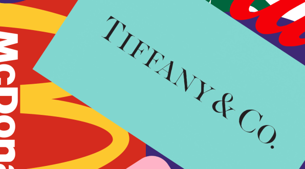
Tiffany & Co. goes one better. It literally owns the color. As a registered trademark, it’s more valuable as an asset than its logotype—both in terms of recognition, and the meaning it conveys.
It’s not controversial to say that color is a pretty fundamental part of building an iconic brand. But plenty of brands get it wrong. In an era where there are more companies fighting for your attention than ever before, too many sacrifice the opportunity to use color to their advantage, both in their initial design and how they go on to use it.
THINK BEYOND SEMIOTICS
Like any visual asset, color carries plenty of meaning. From a broad semiotics point of view (blue is trustworthy, red is energetic, yellow is optimistic, etc.), but also in terms of existing category codes. Fast food is red. Messaging apps are bright green. Enterprise brands are blue. Premium brands are black.
When you’re launching a new brand, or relaunching an existing one, it’s tempting to use these codes as a way of being quickly understood. Color can be a powerful shortcut.
But as with most shortcuts, it comes with a cost.You picked blue because it signifies trustworthiness? Then you better hope you have the budget to compete with the 43% of Fortune 500 companies with blue logos.
Being understood is no longer enough. In this unprecedented battle for attention, your brand color has to work harder.
It’s time to start breaking some rules.
USE COLOR AS A BEACON OF CHANGE
The obvious answer is to look at what your competitors are doing and use color to signal what you’re doing differently.
Payment company Klarna uses a pale pink to stand out from the safe neutrality of the credit card space.
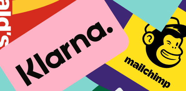
The pink is powerful not just because it’s different, but because of what it stands for. By using a color that had previously been rich in gender meaning, it stands out as a new type of payment company for a young, fashion-conscious audience that actively rejects outdated values. The bold color choice is playing its part—in March of this year, Klarna was valued at $31 billion, making it Europe’s most valuable startup.Similarly, Mailchimp cleverly uses a bright yellow to signify a stand against the corporate sameness of most B2B marketing platforms. A signal to its customers that “growing up doesn’t have to mean buttoning up.” It both depositions its competitors and builds a connection with its audience. As for Klarna, this was a counterintuitive choice that probably felt risky at the time. But it has paid off financially. Mailchimp’s 2020 revenue was $750 million.
USE COLOR TO REFRAME A PRODUCT
Some brands create conflict by borrowing from other categories’ norms, cleverly building understanding without compromising on distinctiveness.
This is starting to happen a lot in the vegan space. Historically, vegan brands have used color to signify they’re a healthier, more ethical alternative to the status quo. But this has become a convention in itself.
Vegan chicken nugget brand NUGGS flips that on its head. It rejects vegan cues and instead uses red, the color of fast food, to normalize its product, signaling to wary consumers that it tastes just like a regular chicken nugget. And then it uses the rest of the brand language to make clear it’s no ordinary fast-food brand.
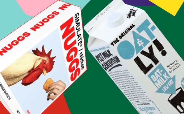
Oatly did the same thing to land its “like milk but for humans” message. It firmly rejected alt-milk conventions and borrowed the colors of a cow, the very thing its competitors were trying to distance themselves from.In doing so, both brands used a distinctive approach to color to simultaneously build understanding and stand out.
It’s an approach that works across all sorts of categories.
Hims reframed telemedicine as a lifestyle product by avoiding the category’s reassuring blues and greens in favor of tastefully muted pastels more reminiscent of the beauty category. DTC aperitif Haus used a very similar color palette to persuade people to think of it less as an alcohol brand you might find in a bar and more as an aspirational design piece for the home.
So consider what behavioral changes you’re asking your audience to make, and look at different ways you might use color to normalize them.
MAKE SURE IT’S AN APPROACH YOU CAN SCALE
Once you’re set on an approach, whether it’s a single lead color or a distinctive combination, you need to think about functionality and scalability. Is it accessible? Picking a bright, poppy color such as Airbnb’s coral or WhatsApp’s green means you won’t be able to set text in it on a white background (the contrast won’t be high enough for those without perfect vision). Does it work as well in print as it does on screen? Traditional printing processes are limited in the range of colors they can reproduce.
Neither issue is a deal breaker, but both are worth knowing about before you commit.
Think about every use case, and then test, test, test.
COMMIT TO IT RELENTLESSLY
Picking the right color isn’t the end of the process. It’s the beginning. Tiffany & Co. didn’t own its blue the moment it picked it. It put in 176 years’ hard work. And counting. If you want to own a color, you need to use it relentlessly, across every part of the experience.
That takes rare discipline. The temptation to “freshen things up” is one of the biggest impediments to brand building in our industry. Research emphatically demonstrates that consistency is fundamental to successful brand building. People don’t get bored of a brand color. But marketing teams do.
And different teams will always argue that specific applications require a different approach. There’s an increasing trend in digital product design toward keeping everything white. Perhaps that makes sense from a UX point of view, but I wonder how often proper consideration is given to what this costs in terms of brand building.
The job of the brand team is to be the voice in the room fighting for consistency and coherence. And color needs to be at the heart of that battle. The more frequently the brand people win that argument, the greater the chance that one day you’ll have a truly iconic brand.
And maybe your very own Pantone color.
This article first appeared in www.fastcompany.com

