Designers have largely shifted their skill sets toward interface design, prototyping, and code. Are writing and art direction getting left behind?
Around 2010, designers the world over proclaimed Photoshop was dead in web design. We moved away from static comps, learned to prototype, and invested our time in tools like Sketch and Axure and designing directly in code. Pixel-perfect comps were finally dead, and it was awesome.
THE “PLACEHOLDER CONTENT PROBLEM”
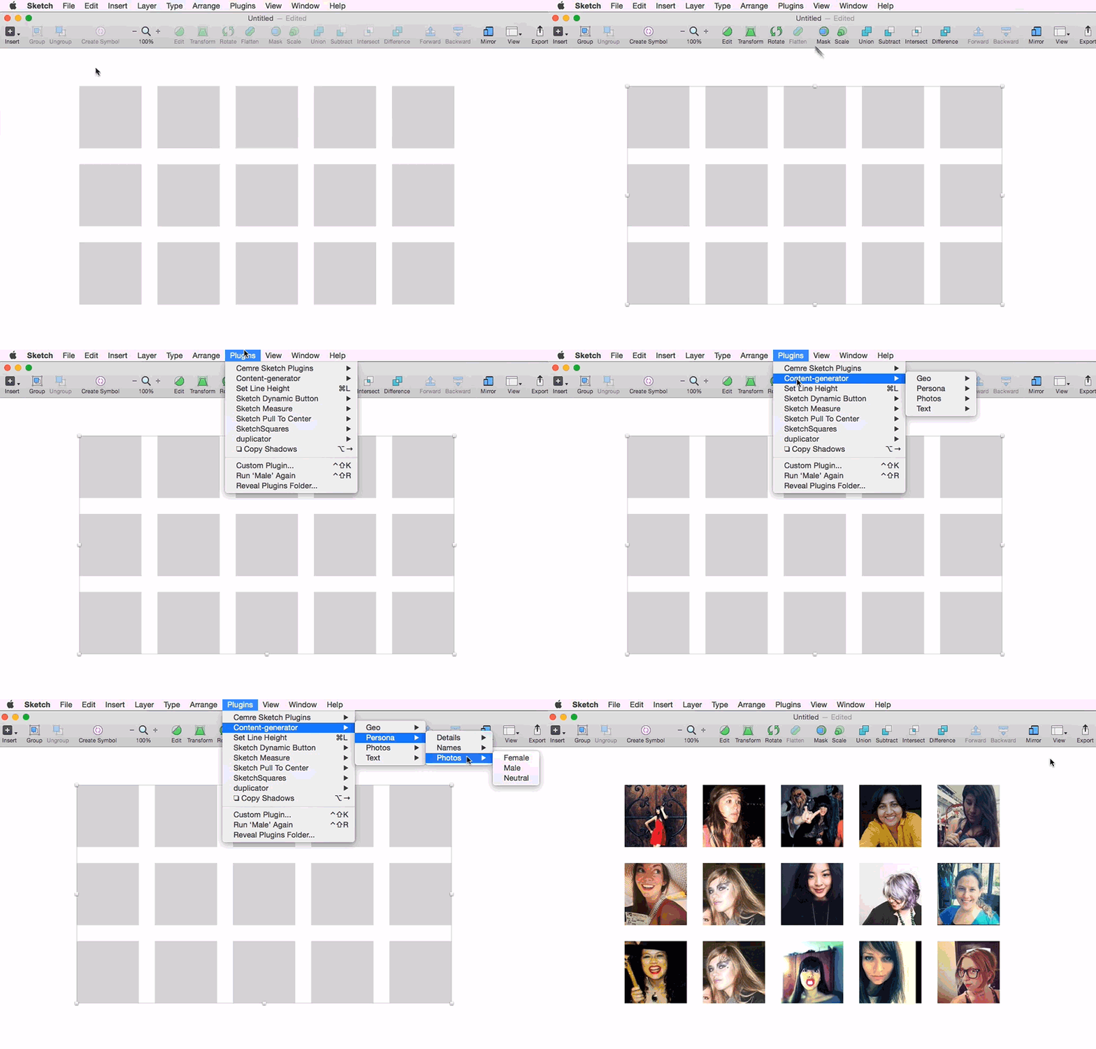
But with designers increasingly focused on the interface, a fundamental problem has emerged. The emphasis becomes the design of the frame, and the content takes a backseat — an easily exchangeable placeholder that can be replaced with more or less anything. Layouts become filled with gray boxes and fake headlines. There is even a plug-in that dynamically generates placeholder content in Sketch. The use of these plug-ins (which are very popular in our office) means the designer only considers the design of the container that holds the content (the interface) rather than the design of the content itself. Which prompts the question: Are the traditional skills of art direction and copywriting getting left behind?

Take, for example, the perennial problem of placing a headline text over the image in a hero area of a website home page. Instead of thinking, “We need to commission art and direct a photo shoot where the photographer accounts for clear space on the right-hand side of the image for the text placement,” what frequently happens is: “Let’s put a white box over the image so the text is legible at any breakpoint.”
Photoshop—for all its flaws—is a tool built around creating beautiful content. Want to create a GIF? Go to Photoshop. Need to retouch a background image so that the headline text pops perfectly? Go to Photoshop. When you design in the browser, images, illustrations, and copy take a backseat. Yes, you can still use Photoshop. But this extra layer (pardon the pun) in the work flow tends to deprioritize the design of words and images.
Art direction and copywriting are as fundamental to the user experience as the UI. Sure, you can have a beautiful UI/frame, but once you have that (we all know a great UI is an invisible UI), all the viewer cares about is what’s inside: the artwork, the story.
THE SWEET SPOT: WHERE DESIGN, TECHNOLOGY, AND CONTENT INTERSECT

The best agencies understand that where design, technology, and content intersect is where the magic happens. Each of these pillars should be treated as a critical piece of every project, none more important than the other.
So how do you go about making a digital product whose content is as beautiful as the interface?
1. Remember the writer is as important as the designer.
Ad agencies have always revered writers as the driving force in the creative process. Consider the most iconic ad campaigns, from “By Mennen!” to “Pardon me, but do you have any Grey Poupon?”: Writers were generally responsible for the conceptual heavy lifting. But design agencies have never held writers in the same regard. When you live in a world where content is king, the design agency that does not have a full-time writer on each of its projects is a foolish one. The writer is as important as the designer.
2. Design with real content from the start.
This goes way beyond avoiding “lorum ipsum.” It means hiring a content strategist and a shit-hot writer to create a concept for what and where you need content and even entire sections for your digital product, as well defining the style of writing, tone of voice, and creative. Involving writers from the start will shape the structure of your project every bit as much as what the UX designer does. For some clients, it could also mean consulting on the overall editorial strategy.
3. Take a cue from ad agencies for art direction.
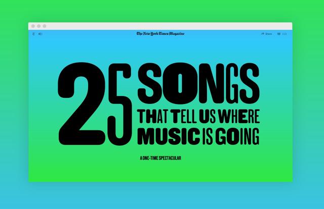
See the attention to detail the big ad agencies give to art direction? That is the benchmark for digital products, too. Every image in your design needs to be considered, art directed, and retouched. Think your image is perfect out of the box? Sorry, but that’s not the case. I have never seen a photograph or illustration that didn’t need at least some minor retouching/editing to be optimized for a digital context. The art direction of your content is as important as the interface. Consider the art direction work the New York Times puts into every piece of content in its visual stories. Every pixel is considered and treated with huge attention to detail.
4. Don’t design in the browser for early stages.
You may be the Master Unicorn of design and code, but designing in code or in interface tools in the beginning stages will create more work in the long run. Tools like Sketch are not great for developing visuals and art direction concepts. Use Sketch for making interfaces, nothing else.
5. User-generated content needs design, too.
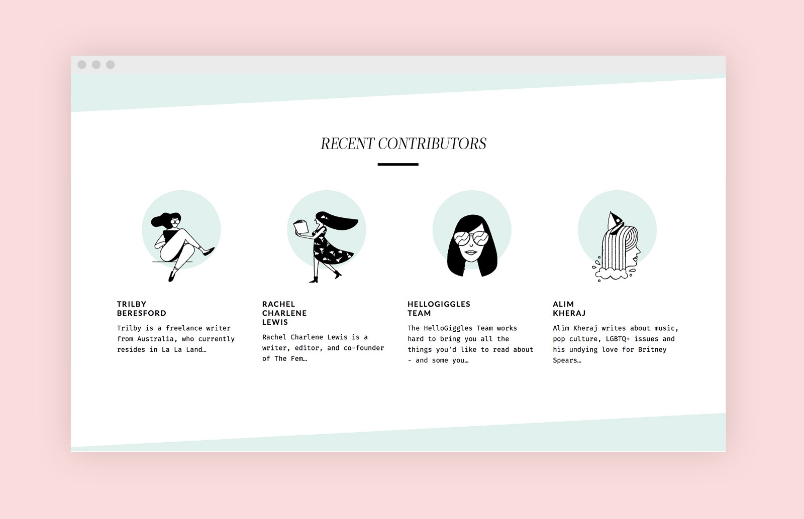
User-generated content is not an excuse to use the gray boxes of doom. There are always ways to design UGC, whether by applying filters or presenting content in a more creative way. HelloGiggles, a client we recently worked with at Edenspiekermann, publishes more than 70 pieces of content per day, about a third of it user-generated. The user profile photos were usually low-quality, so we commissioned illustrator Chris DeLorenzo to create a series of avatars and illustrations so that the pages maintained a clear, uniform aesthetic.

THE GOLDEN AGE OF CONTENT DESIGN
One glimpse at a site like the Awwwards or the interactive editorials of theNew York Times indicates there is certainly a lot of beautiful digital content design being made. The smartest of the digital-first agencies like Huge are going to great lengths to create cross-disciplinary teams where visual design, UX design, and content design (both art and copywriting) are equal pillars of every project. Want to be sure of a job? Become a digital copywriter for a content designer. I promise that you’ll be in high demand. When you combine ad-agency level copywriting and art direction with technology and a digital-first, user-centered mind-set, you can create products that are both functional and beautiful.
This article first appeared in www.fastcodesign.com
Seeking to build and grow your brand using the force of consumer insight, strategic foresight, creative disruption and technology prowess? Talk to us at +9714 3867728 or mail: info@groupisd.com or visit www.groupisd.com

