Siempo is a “phone for humans” that’s carefully designed to encourage focus and discourage distraction. Will it catch on?
The “dumb phone” has a certain appeal. It doesn’t track your every move, it won’t ping you with tons of notifications, and the clunky interface means you won’t lose hours swiping through Instagram or Tinder. But at the same time, you don’t have access to essential and sometimes vital apps like Google Maps, not to mention a calendar, camera, or note-taking app.
That’s the void in the phone market that the Oakland, California-based startup Siempo is trying to fill. It’s building a phone that’s smart enough to offer functionality many consider indispensable—navigation, calendar, email, and sleek, modern design—while giving users control over functionality that they might find distracting, time-wasting, or annoying.
The Siempo phone, being funded now on Kickstarter for $279, relies on an entirely new interface to facilitate this more serene form of smartphone UX. Most important is what cofounder Jorge Selva calls an “intention field.” When you open up the Siempo, you’re presented with a blank text box. If you want to send a text message, just start typing what you want to say, and select the text message option that pops up. If you want to call someone, just start typing @ and their name. If you want to add a contact, or find an address, or save a note, you just start typing and the phone’s interface presents you with the available options.
It’s a radically different approach to the home screen design of both iOS and Android, both of which have a desktop-like screen filled with apps. Selva says the team based the design on research that shows that more traditional phone interfaces, often peppered with red notification indicators, tend to lead down the distraction rabbit hole. With the Siempo, you can navigate to a screen showing your apps with a quick swipe, but the open dialogue box is a way for you to accomplish what you meant to do when you opened your phone in the first place—text a friend, make a calendar entry—without getting distracted by anything else.
“We’re technologists, we love tech, and we don’t think it’s all bad,” Selva says. “We’re just trying to say that there’s a real need to evaluate how these devices are having a real impact on our lives. It’s buying into a device that makes some decisions up front for you so you don’t have that cognitive load.” Instead of having to try and regulate your internet usage, why not outsource that work to the phone itself?
Selva started Siempo with Andreas Gala and Mayank Saxena in 2014 after a work trip where he decided not to bring his smartphone. “I realized how addicted and overly distracted that I’d become by my smartphone,” he says. “On that trip I was waking up early, I was reading, I was writing, and I felt more present, alive, and happier than I had in a long time.”
 [Photo: Courtesy Siempo]
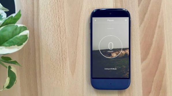
The Siempo’s UX makes it easy not just to mute your phone, but to control where and when you see notifications on a granular level. The phone’s operating system includes a “Pause” option, which lets you stop all incoming notifications for a set amount of time (unlike the iPhone’s “do not disturb” feature, the notifications won’t show up at all until the allotted period is up, unless you’ve preselected certain people’s messages or calls to come through). Instead of notifications arriving exactly when they’re received, users can set their preferences so that notifications arrive on their phone in batches, every 15 or 30 minutes—a design choice that’s meant to curb compulsive phone checking of messages.
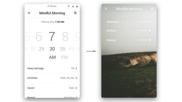
Another feature is called “Mindful Morning,” and it’s meant to help people stop spending their first moments of the day looking at their phones. It’s a combination of an alarm clock, plus a series of preset timers, that completely locks your phone until they’ve run out. For instance, you could set one for 30 minutes for exercise followed by a 10-minute timer for meditation—then you can only look at your emails after you’ve done those things. A couple of third-party apps are supported, including Google Maps and Calendar—but no social media.
The Siempo has just one high-res, rear-facing camera. That’s right—no selfies.

The team is now working on finalizing the UX for email and browser, both of which are opt-in features of the phone. “The browser isn’t inherently bad, but for a lot of people, they don’t have good enough self control to regulate how they they use it,” Selva says. So the Siempo takes care of that for you—you can change the settings so you get locked out of a certain site, like Facebook or Twitter or Reddit, after a certain number of hours per week. If you’ve shut off the browser for a certain period of time, but suddenly really need access to it, the team is experimenting with forcing you to turn your phone on and off twice in order to use that feature. This is meant to dissuade you from mindlessly looking at things, but enable you to use the internet if you really need it. They’re designing friction into the UX, rather than user friendliness.They’re also thinking about how subtle tweaks can improve usability during emergencies. For instance, if someone calls you twice, the second call will ring. You can also set auto-responders on text messages to let people know that you won’t be responding immediately—but that, should they need to get in touch with you at that moment, they can respond with an “0” at the front of the message.
Selva himself now uses a prototype of the phone and he says that despite a period of adjustment, it’s changed his life. “Overall, it’s about a week where you feel a little bit of the FOMO, but pretty quickly so many of the things we think are important in our lives that we need to check constantly, really aren’t that important,” he says. “I really realized how much time I was spending, specifically when I would wake up using my phone. My morning would just be ruined. Moving more into a place where I’m being proactive and starting things in a way that benefits me has been life changing.”
Of course, it’s hard to imagine giving up access to the app store ecosystem or the ease of use and convenience that comes with a smartphone, especially for working professionals. Still, Selva believes that there’s enough of a market for a phone that has some of the key features of the smartphone but also gives the user more power to limit the device’s reach however they choose.
During our conversation I received a number of notifications, and I tried my best to remain present while fighting the urge to look and respond. In that moment, the Siempo truly would have been a welcome distraction-blocker.
–
[Photo: Courtesy Siempo]
This article first appeared in www.fastcodesign.com
Seeking to build and grow your brand using the force of consumer insight, strategic foresight, creative disruption and technology prowess? Talk to us at +9714 3867728 or mail: info@groupisd.com or visit www.groupisd.com


