In Uber’s latest move to inch toward profitability, it’s trying to convince people who use its app for ride-sharing to also use it to order dinner.
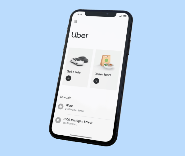
When you want to catch an Uber, the first thing that greets you in the service’s app has been a map. But starting today, Uber is beginning to roll out a radical new home screen that ditches the map and instead presents a grid of all the services the company offers—just in case you’ve forgotten about Uber Eats amongst the host of startups angling to deliver your dinner.
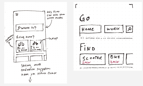
For now, this new screen will include Uber’s ride-hailing service and its food delivery service, though the design can adapt to showcase the company’s other services, like bikes and scooters as well. Early design mockups also reveal how the company could expand beyond these core services and add anything from chopper rides to perhaps grocery delivery or even travel planning to its new app interface—though Uber stresses that these services showing up in mockups doesn’t necessarily mean it plans to introduce them (it is, however, working on helicopters).
“Most people today know Uber as a ridesharing app: they open the app when they want to go from A to B,” the primary designer of the new app’s home screen, Joost van der Ree, told me via email. “How do we help widen that intent from just ridesharing to other modes of transport and daily needs?”
The new landing page for the app has a grid-like design, with large icons that depict cars and food delivery bags. A black arrow beneath each icon indicates where you should tap to be taken to the more traditional map interface for each service. At the bottom of the screen, the new design has quick links for ride destinations and food that you order often.As of March 2019, Uber Eats has about 25% market share (a close third behind GrubHub and DoorDash), with flat growth over the last year. Becoming part of the core Uber app could give the service a crucial edge over its slightly more popular competitors. Uber has already started integrating Uber Eats into its app with small reminders, primarily for promotions. The company’s CEO Dara Khosrowshahi told The Verge earlier this year that when customers use both Uber Rides and Uber Eats, their overall engagement with the company “more than doubles.”
“Suffice it to say we are starting to experiment in ways in which we can upsell our ride [hailing]customers to Eats deals in a way that, you know, to be plain spoken, isn’t annoying, and in a way that is beneficial to our riders,” he said. Hitching the ride-sharing service to Uber Eats, which has grown quickly since it launched in 2015, appears to be a way to push the company closer to profitability after a rocky IPO earlier this year revealed the billions of dollars the company continues to lose every quarter.
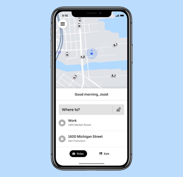
Along with helping the company cross-promote its services, the new core app takes a cue from Uber’s Lite app, which is popular in India, Latin America, and the Middle East. That app was the first to downplay Uber’s traditional map interface, since it proved confusing for users in these parts of the world.
This redesign could also help solve a problem that many of us face, whether from cognitive overload or lack of phone storage: too many apps. If downloading Uber Eats was a primary reason why you didn’t use the service, Uber has removed that friction. “By bringing these two things in one common space, we’re making navigating across our family of apps a lot simpler for our users,” says Samiksha Kothari, a product design manager who led the redesign process.
The redesign appears to be the biggest step Uber has taken so far to convince more ride-hailing users to use its food delivery service—but such a large departure posed problems.“The real challenge was finding a way to avoid the app becoming cluttered, hard to navigate, and cumbersome if multiple services were ‘colliding’ with each other,” Van der Ree says. The design team, which called the project the “future of the Uber app,” didn’t want to overstep and make the app unrecognizable to the company’s loyal users.
But because integrating its services into one app is such a monumental change, Uber is still experimenting with the new design and isn’t yet talking about a timetable for completing the process. The design team decided to launch two separate versions of this app, using a technique called “bookmarking” where one version represents only a slight change while the second is a complete redesign. The more subtle version still integrates ride-sharing and food delivery, but retains the map interface. Instead, it has a menu bar at the bottom that makes it easier for users to toggle in between Rides and Eats.
Uber will also start showing other transportation options, including e-bikes, scooters, and public transit schedules for a growing number of cities. In a similar move, Lyft also recently released a new version of its app that integrates bikes, scooters, and public transit options with a swipe-able menu.
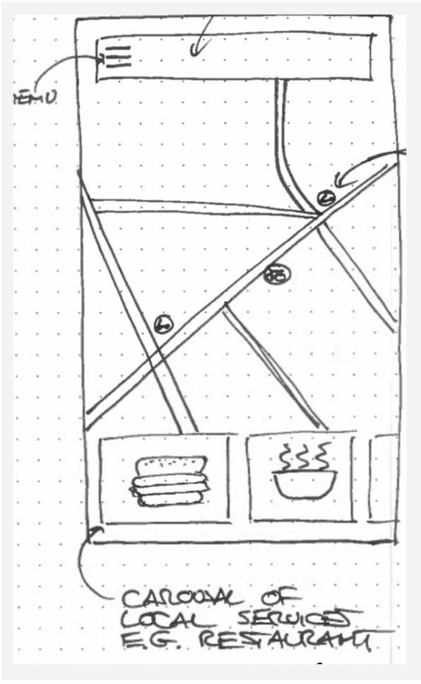
The complete redesign moves away from the map entirely in favor of square icons that represent the different services. “A map with cars on it communicates that Uber is a service for getting a ride, but we’re moving far beyond just rides,” Van der Ree says. (Uber Eats will stay available as a separate app. The interfaces for drivers won’t change at all, though the driver app will now feature a heat map of rider demand and an earnings estimator.)
By testing out two new visions for the Uber app, the company’s design team will be able to get feedback on which version consumers prefer before making a final decision. And if the design does its job, Uber riders who use Grubhub or DoorDash to have dinner delivered will remember that there’s yet another delivery service, right there in the Uber app.
–
This article first appeared in www.fastcompany.com
Seeking to build and grow your brand using the force of consumer insight, strategic foresight, creative disruption and technology prowess? Talk to us at +9714 3867728 or mail: info@groupisd.com or visit www.groupisd.com

