The company skewered branding, the innovation craze, and media frenzy in one fell swoop.
The culture of logo and branding reveals has grown increasingly absurd in recent years. So absurd that Virgin America made it the butt of an April Fools’ Day joke—and it’s a damn good prank.

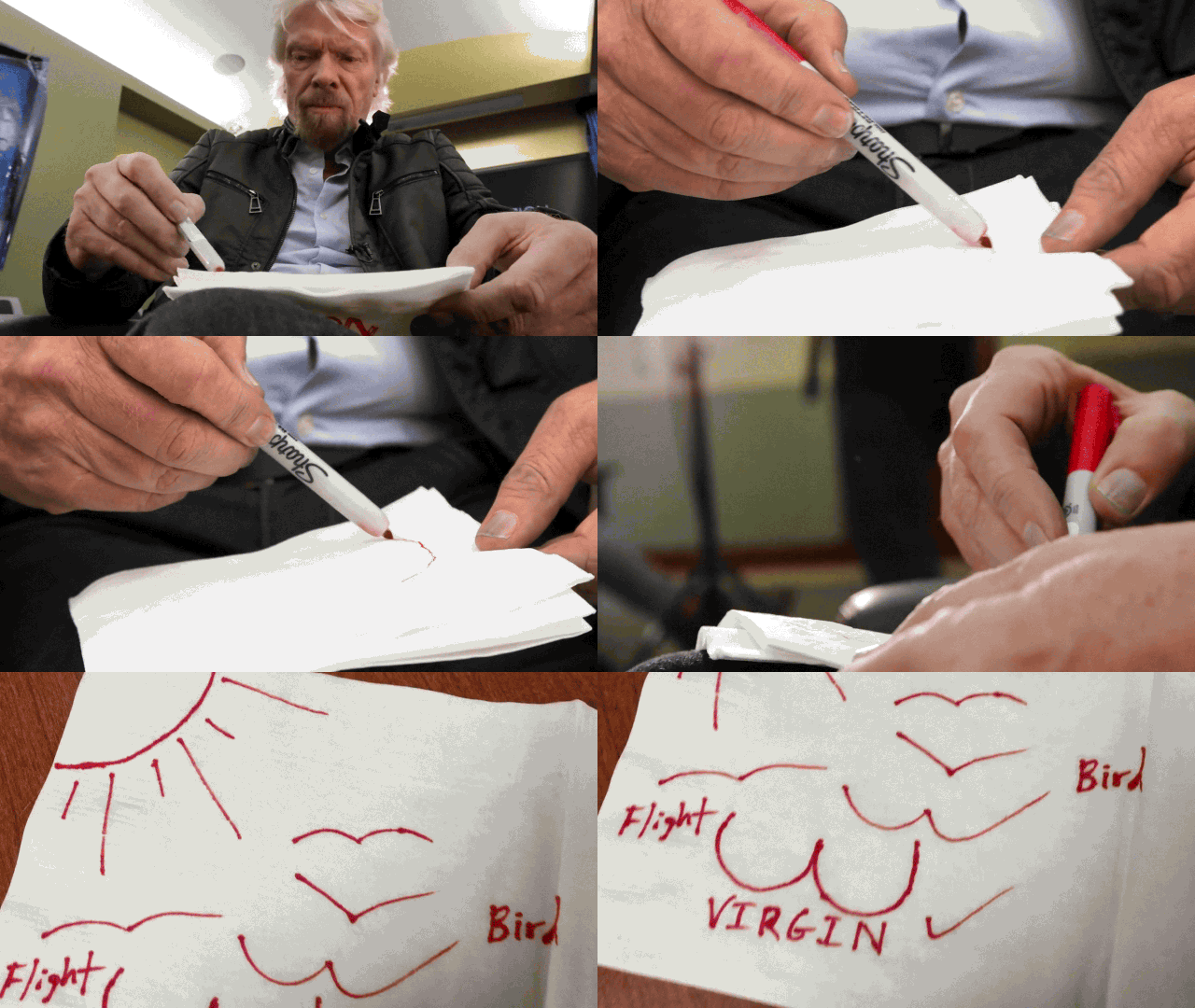
In a video and blog post, Virgin founder Richard Branson and his design team detail the origins of a new logo, using the kind of self-important, pretentious language that’s become common in such announcements. In fact, if it weren’t for a couple of glaring tip-offs to the satirical story—a designer clutching a pair of doves and lewd napkin sketches, to name just two—it could pass off as legitimate. Nice work, Branson and team.
Here’s how the team describes the “new” logo:
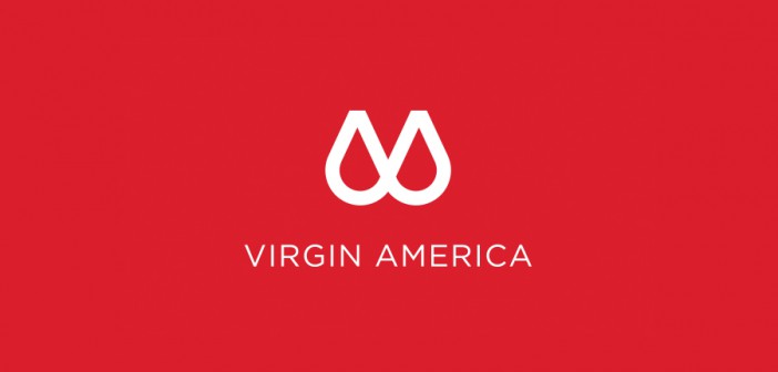
Ultimately, every stroke of our new logo represents the essence of who we are—and what we mean to people. The combination of sharp angles and sleek, sexy, supple curves are meant to surprise and delight upon repeat views—but also highlight humanity’s inherently contradictory nature, the yin and yang, the id and the ego, the fact that sometimes we want to stay connected and work with fleet-wide Wi-Fi, and sometimes we want to just kick back and relax with on-demand entertainment, food, and drink.
“It represents the human-centered design that’s at the core of Virgin America,” one designer quips. Virgin took the prank to the next level by inventing a faux creative agency—N_Fuzion—and building a website for it. Here’s how the company explains arriving at the design:
To achieve the look and feel, a team of 15 designers spent over 2,500 hours perfecting the precise shape of the circles. In fact, if you look closely, you’ll see that each circle is designed to mimic the nose of our Airbus A320 aircraft. To achieve this effect, Connor had us physically remove the entire nose and flight deck of one of our aircraft. The 14-ton section was then lifted with a crane onto a giant sheet of paper the length of an entire football field, at which point Connor traced the shape with a charcoal pencil to achieve the thick, bold lines you see bordering the logo.
The video features Branson sketching doodles of images that he’s “always been drawn to,” which were then tacked onto a wall—à la Ideo’s famous Post-it ideation sessions. The designers then riff on the sketches to develop the concept.
One anonymous Co.Design staffer compared the resulting symbol to a cross-your-heart bra, which would reinforce how Virgin says that half its design represents its “supportive approach to guest care.” (The other half is “tech-forward innovation.”) Really, it looks like a pair of Truck Nuts, but you could also say it’s eerily reminiscent of the bottom half of Airbnb’s Belo. Coincidence? Doubtful.
For the story behind Virgin’s real logo, we’ve got you covered.


