Most of us have participated in at least one “2020 vision” project at work. Now that 2020 is finally here, it’s time to bring our so-called visions into fruition.
Every year, the UX Collective publishes a report on the state of the UX industry, covering everything from the tools we use to the career challenges we face. The report is based links we’ve curated and shared (more than 2,411 this year), written by brilliant designers and thought leaders in the industry.
The 2018 report focused on how the experiences we create can impact the world—from enabling tech addiction to influencing democratic elections. But this year’s report carries a more positive outlook: 2020 is the year of pragmatic optimism, focused on tangible action, and an understanding of how to turn frustration into motivation to create better things in the world. As designers, we know that the key to solving any problem is optimism. If we didn’t believe we could fix things, we wouldn’t have become designers in the first place. You can read our full report here, but below you’ll find three takeaways on what to expect for UX in 2020.

DESIGNING FOR THE POST-TRUTH ERA
The rise of deepfakes videos and misinformation being used to drive political agendas makes us question our sense of reality. As designers of digital products for the next decade, we need to focus our efforts on designing for transparency and encouraging critical thinking from our users.
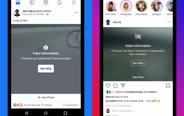
In May 2019, American president Donald Trump tweeted a video of Speaker of the House Nancy Pelosi that had been edited to make her sound drunk. Meanwhile, when challenged on TV about Facebook’s role in the viral spread of this video,VP of Product Policy Monika Bickert argued for Facebook’s approach: instead of removing the fake video from its service, Facebook opted to show an alert warning users that the veracity of the video has not been confirmed by fact-checking agencies.

A few months back, Youtube introduced a disclaimer next to its video player UI that lets people know which company or entity is behind the content they are watching. The Guardian has added the date an article was published to its social thumbnail, to prevent users from re-sharing old news stories thinking (or pretending) that they are current.
Designing for transparency
We’re living in an era of fragmented truths and whataboutisms. Globally, at least 70 countries have experienced disinformation campaigns. “How could we possibly compress all of these contradictory reality bubbles into a single history textbook?” asks design researcher Aaron Lewis in his brilliantly written article about the “post-truth” present.
COMPANIES NEED TO MAKE PRODUCT CHANGES TO FIGHT THE HARM OF MISINFORMATION—BUT HOW FAR ARE THEY WILLING TO GO?”
News outlets have started to re-think the way articles are written to mitigate ambiguity and the misinterpretation of facts. Axios, for example, has a unique way of outlining different perspectives in its articles and guiding readers towards a more critical approach to news consumption.
“This is an extremely complex challenge for everyone working in the news industry, and the design is only a small piece of the puzzle,” explains Al Lucca, Head of Design at Axios. “The bigger challenge designers will have in 2020 is on how to take people out from the noise and anxiety cycle of social media and online news, and teach them how to spot fake news, which eventually will bring everyone back to healthier and more trustworthy conversations.”

The same way Google has started its journey to combat deep fakes, Adobe has recently announced its own service to spot manipulated images and videos through the use of AI. The same company that pioneered image and video editing is now helping people differentiate Photoshopped photos from real ones.
As product designers in the year 2020 we have a lot of work ahead of us: designing tools to filter out fake content, making users more aware of the treachery of deepfakes, and stopping the spread of misinformation. But even more importantly, we will be responsible for raising awareness inside of our organizations, establishing principles around truth and reporting how our platforms might be misused by agents with hidden agendas.
THE RISE OF MICRO DESIGN COMMUNITIES
As designers, we have all joined more design-themed Slack, Linkedin and Facebook groups than we can keep up with—maybe in response to the visceral human need to feel like part of something bigger than ourselves. But the reality of online design communities is quite different from what they initially seem to promise. Groups with thousands of designers either become inactive once members realize they have little in common, or remain active but end up devolving into an endless stream of self-promotion and content marketing pieces. Discussion threads on Reddit or DesignerNews don’t delve deep enough into a topic because they are held back by miscommunications between participants. Design Twitter slowly becomes a shallow stream of polarizing, angry, and loud voices.
While large online communities play an important role in making design more accessible to more people, we have to re-focus on the smaller communities we build ourselves in order to get the full value out of our conversations.
All this doesn’t mean designers have stopped having online conversations with one another; it just means these conversations are migrating to a new type of community which is more intimate and focused. They are happening over WhatsApp, Telegram, direct messaging, and super-niched hubs. They are happening one-to-one or in small groups, rather than in large forums. Designers are informally creating their own sounding boards: people with whom they feel comfortable sharing feedback, exchanging design references, discussing trends, or asking for advice on topics like salary, work dynamics, and career.
The same shift can be seen with design events. While large design conferences are a great platform for networking, small local meetups are more rewarding when it comes to learning and development, since they allow participants to engage in more real and honest question-and-answer sessions.
“The intimacy of smaller settings allows people to open up to each other in more authentic ways,” explains Kat Vellos, Senior Product Designer at Slack and founder of BayAreaBlackDesigners. “Smaller groups make it easier for participants to build psychological safety with each other. That’s much harder to do in a large room with hundreds or thousands of people. Psychological safety is the most important thing for getting people to trust each other and gel, and small groups/events will always be able to provide this in a more manageable way than humongous conferences.”
In 2020, the most relevant discussions in design are becoming local, authentic, and focused. Large communities become primarily a way to find and build smaller ones. In a world where everyone is shouting at each other, quieter and more thoughtful conversations become incredibly precious.

INVISIBLE DESIGN SYSTEMS
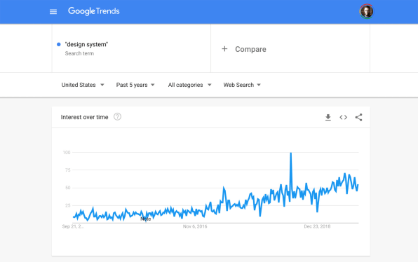
We see the term Design System everywhere: conferences, articles, tweets, courses, capabilities slides. A quick search for “design systems” on Google Trends shows that interest in this topic has been on the rise over the past few years. On Medium, a handful of new articles are published with that tag every single week.
It’s easy to appreciate design systems. From a user experience perspective, designing interfaces with common UX patterns creates familiarity for users, since they know what to expect from experience moments they regularly encounter in the product. From a technical perspective, reusable UI components can mean more efficiency, scalability, and less re-work for developers.
A design system is not (just) a UI library
The first image that comes to mind when one thinks about design systems is that of a component library: A repository of UI patterns such as buttons, dropdowns, and cards that designers and developers can easily copy and paste to speed up their work. But that’s only the tip of the iceberg: A design system has to take into consideration broader aspects of a company’s operations, including tooling, governance, people, accessibility standards, technology stack, and workflow.
When these broader aspects are not considered, companies end up with design libraries that are abandoned within a few months—which is why designers need to start thinking about design systems as a living organism that connects the whole organization.
Design system, design governance, and design library are three different projects with three different approaches. One won’t solve for all.
In an article where she coins the expression “Invisible Design System,” design systems advocate Jina Anne questions the necessity of having those public repositories as we evolve our practice: “As our design and engineering tools get closer and closer together, will we come to a point where we don’t need the website? Can our tools surface suggestions for better accessibility, localization, performance, and usability, because our design system is baked into the tools?”
A design system is a reflection of a company’s values
“Critically, a design system is about people: how they interact, how they understand one another, and how they work together to achieve a common goal. It’s made by people, used by people, and experienced by people. It’s challenged and shaped and broken by people. (…) Our role as a systems team turns from that of organizer and enforcer to that of anthropologist and researcher.” — Daniel Eden
BEFORE REVISITING WHICH COLOR TO USE FOR CALLS-TO-ACTION, WE FIRST NEED TO REVISIT THE VALUES OUR COMPANY HOLDS.”
The experiences enabled by a company reflect its values, both in terms of the specific service it provides, as well as its worldview. As designer Tatiana Mac explains in her talk, Building Socially Inclusive Design Systems, without a clear intent and a clear awareness of our biases, the design systems we create perpetuate established patterns that exist in the world around us. If 83% of tech executives are white, and if the ratio between men and women is 4:1 in STEM, there is a high chance the design systems created by that group will exclude people who don’t share the same race, gender, sexual orientation, philosophy, socioeconomic status, language, nationality, and ability as them. No wonder why every gender dropdown out there still starts with the option “Male” and ignores non-binary users.
In 2020, we should be spending less energy on creating new components for our design system, and focus our attention in understanding the systems behind the design.
Check out the full State of UX in 2020 report here.
–
This article first appeared in www.fastcompany.com
Seeking to build and grow your brand using the force of consumer insight, strategic foresight, creative disruption and technology prowess? Talk to us at +9714 3867728 or mail: info@groupisd.com or visit www.groupisd.com

