America’s particular brand of political turmoil doesn’t have one logo that sums it up. It has approximately 1,000.
The logo archive of the Center for American Politics and Design makes this abundantly clear. A recent update added congressional, gubernatorial, and presidential primary and general logos from the past two years. Look closely, and you’ll see that American politics has had a bit of a refresh since the 2018 midterms. And I’m not just talking from a design perspective.
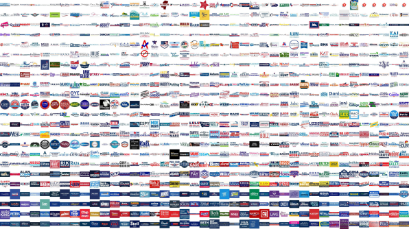
Logo trends since 2018 offer hints at how American politics has changed in the past two years. Susan Merriam, a cofounder of CAPD, helps break down the biggest trends—the good, the bad, and the Trumpy.
DEMOCRATIC DIVISIONS
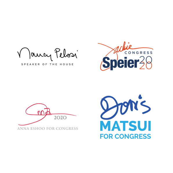
There are a couple of trends that point to shifts within the Democratic Party. First, there’s a microtrend of senior women incumbents using their signature as their official wordmark. You can spot this on logos for Representatives Nancy Pelosi, Jackie Speier, Anna Eshoo, and Doris Matsui. Merriam suggests the strategy could be to give them an authoritative look. Signed, sealed, delivered is their brand.
The second big trend, and a unifying factor among progressives, is that they’re all pretty different and avoid the old political tropes. Many are following Alexandria Ocasio-Cortez’s branding mold and communicating their perspective with a fresh visual look. That means a lot less red, white, and blue, stars and stripes, and flags. Instead many are leaning into new type treatments and colors such as yellow, purple, and orange. Candidates in districts that generally vote Democrat by a margin of 20 points, or first-time candidates, such as Cori Bush, Nikema Williams, and Jamaal Bowman, are following suit, Merriam says.
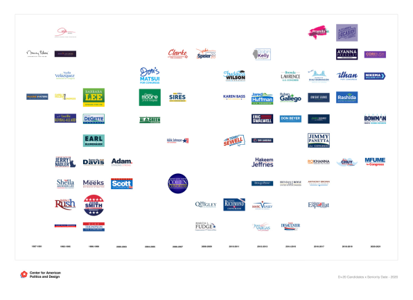
Several senior incumbents such as Earl Blumenauer, Carolyn Maloney, and Adam Schiff seriously updated their logos, too. Schiff dropped his previous, clunky logo lockup for a more optimistic blue gradient serif (and now has a secondary sans serif wordmark that just says “Adam”). Merriam suggests these more contemporary changes could be in response to progressive challenges this cycle.
SEEING RED
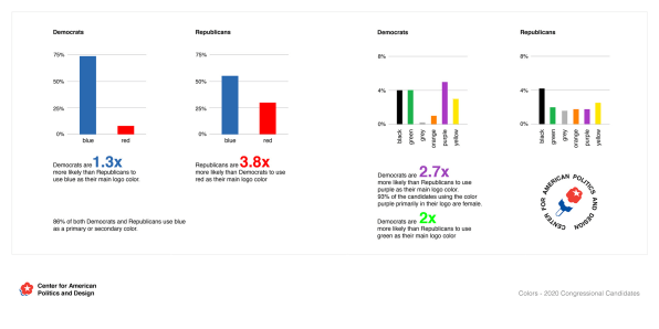
Democrats picked up 40 seats in the House in 2018. The remaining Republicans are largely either conservative incumbents who held on to their seats or new candidates who are even further right on the political spectrum than the Republicans who lost to Democrats in swing districts. And it shows. Whereas many incumbent Democrats have changed their logos since 2018, Republicans were decidedly change-averse. Almost all Republicans used the same logo or made only slight changes to their designs for this year’s races, according to Merriam. The only real change? A slight increase in red logos among GOP. Groundbreaking.
TRUMP TRAIN TO NOWHERE
Back in 2018, there was only one Trump logo look-alike among Republicans. Now, there are nine congressional candidates using the rectangular frame punctuated with five stars at the top. This is obviously meant to suggest loyalty to Trump and appeal to his base. And from a design perspective, it’s moving even further from Obama’s clean, crisp, corporate-looking brand. But hey, at least they’re not using the original Trump campaign logo. That one’s NSFW.
PUN OVER PARTY
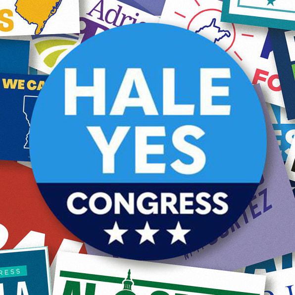
So far, this is a microtrend among minor candidates: We’re seeing logos and wordmarks that use punny messaging and visuals, which read less “congressman in higher office” and more “self-aware everyman.” There’s MAGA Republican Chris Bish (from California’s 6th Congressional District) asking constituents to “Send a Bish to Congress” and Democrat Chris Hale (of the 4th in Tennessee) asserting that “Hale yes,” you should send him to D.C.
This article first appeared in www.marketingprofs.com

