From IBM to I ❤ NY, designers at Pentagram, Moving Brands, Under Consideration, and more pick their favorites.
A logo is meant to be a brand’s most enduring symbol, a graphic totem that distills a company’s essence down into a single graphical mark that is beautiful, flexible, and memorable. Crafting such a deceptively simple symbol is a massive undertaking, so it’s no surprise that the majority of the world’s logos are so disposable. But when a logo achieves those lofty goals? It’s the design equivalent of what Robert Frost once wrote about great poetry: You never get over it.
Of course, what’s immortal for one person might be boring to another, and that goes double for designers, who tend to be opinionated on the subject. With that in mind, we set out to discover what some of the most talented graphic designers working today believe is the best logo ever made. Their responses range from surprising to provocative, spanning the world’s oldest trademark to a famously accidental logo. These are the logos that speak to them, again and again.
The ones that, as Frost might say, they just can’t get over.
I ❤ NY: “AN N.Y.C. LANDMARK IN AND OF ITSELF”
Designed by Milton Glaser for the New York State Department of Commerce, this classic mark has fronted T-shirts and bumper stickers since 1977. In execution, it’s simplicity itself: a slab serif font designed to look like it’s fresh copy right off a typewriter, mixed with a red, bubbly proto-emoji for love. But that simplicity is what makes it so inclusive and adaptable: Everyone can understand and love I ❤ NY.
That’s why Min Lew and Thierry Brunfant, partners at Base, give it their vote for the greatest of all time. “It’s not only a logo, it’s a sentence,” they write. “It’s inclusive. It can be appropriated by everyone. And it was! It’s a noncommercial icon that became commercial because of its emotional strength, which is why it has become the graphic icon of N.Y.C. In fact, along with the Empire State Building and the Statue of Liberty, I ❤ NY has become an N.Y.C. landmark in and of itself. Can you name another logo that achieved this status for a city?”
BASS ALE: IT’S “HARD TO BEAT” THE FIRST TRADEMARKED LOGO
When we asked Pentagram partner Eddie Opara to name his favorite logo, he picked one that’s almost 150 years old—and was designed by a person whose name has long been lost to history. His choice, the Bass Ale logo, is an utterly simple and iconic red triangle created in 1875; it has the distinction of being the world’s first registered trademark.
“I’m not going to say Coca-Cola, IBM, or McDonald’s, which have used their monetary power in product marketing to elevate their brands,” Opara writes. “What I’m interested in is that you don’t have to be a ubiquitous corporation to have the greatest mark.” Bass Ale isn’t as big as those massive brands, but in Opara’s eyes, its logo easily beats those larger corporations. “I see the Bass logo as standing out through its reductive, iconic nature,” he says. “Through simplicity, it relays its character. It’s a classic, the first, and hard to beat.”
IBM: A LOGO BUILT TO LAST “AS LONG AS CIVILIZATION EXISTS”
Not every graphic designer we asked ignored the big boys, though. Armin Vit, the prolific logo critic and cofounder of graphic design firm Under Consideration, gave Paul Rand’s iconic IBM logo the nod for world’s greatest.
Designed in 1972, Rand’s eight-bar logo has been synonymous with Big Blue for almost 45 years now. That’s an eternity, in an era when tech companies seem to rebrand every year, but Vit credits Rand with creating something timeless. “In terms of longevity, this is one of the few logos that can go on for as long as civilization exists,” he writes. “Saying that a logo is timeless is a cliché, but this one literally is timeless in that it manages to convey technology without being dated to a specific advancement or moment in time.”
“The lines can be continually interpreted in any way whatsoever, and they take on the meaning of whatever IBM decides to push at any given time, whether that’s Watson or cloud services. It’s an amazing bit of typography that can be made into a huge sign for a building or a tiny bug on a screen, without sacrificing recognizability. And this doesn’t even begin to cover the amazing alternate version of Eye Bee M.”
THE 1968 OLYMPICS: IT CAPTURED “A SPECIFIC TIME AND PLACE IN HISTORY”
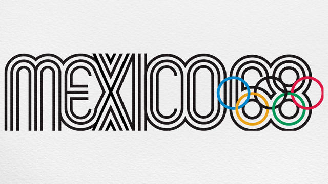
Not content with naming just one logo as the world’s greatest, Vit cast a second vote: the logo designed for Mexico’s 1968 Olympic Games by American graphic designer Lance Wyman. In a way, this mark is similar to the IBM logo, using repetitive geometry to create typography. “[This logo] was the perfect visual manifestation of a specific time and place in history, capturing the exuberance of the 1960s, the culture of Mexico, and the fledgling rise of corporate identity programs,” Vit explains. It also almost perfectly integrates the Olympics rings “into a very distinct visual language that created a powerful, unified graphic between the place (Mexico), the time (’68), and the event (the Olympics).”
The logo is polarizing among designers. For example, Milton Glaser has said that it has a tendency toward illegibility, and Vit admits that the slightly convoluted nature of the design would have it be inappropriate for longer-term use. Still, he argues that Wyman’s design is easily an all-time great. “On its own, it was a great logo, but the fact that it exploded into some of the most amazing identity applications in the history of graphic design is a testament to how strong this logo was a seed for everything that grew out of it,” he adds.
FERRARI: “POWER, GLAMOR, SPEED, COMPETITION”
How do you symbolize the luxury of one of the most powerful cars on Earth? If you’re Enzo Ferrari, founder of the eponymous luxury car brand, you borrow it from the side of daredevil World War 1 fighter pilot Francesco Baracca. Even without that bit of trivia attached, Toby Southgate, worldwide CEO of Brand Union, thinks that the Ferrari logo—a prancing horse on a yellow shield—is the world’s greatest logo.
“Signor Enzo Ferrari’s favorite prancing horse, this icon connotes power, glamor, speed, competition and is immediately associated with the Ferrari brand,” Southgate writes. “It doesn’t need to lock together with the equally famous typographic wordmark; most of the time, it doesn’t exist in that format. It’s exclusive and aspirational, bastardized only slightly by its placement on caps and shoes and luggage by the licensing partners Ferrari (mostly) chooses to engage with.”
THE V&A MUSEUM: THE “PERFECT BALANCE OF ELEGANCE AND INTRIGUE”
London’s Victoria & Albert Museum, often abbreviated as the V&A, is the world’s largest museum of decorative arts and design, with a collection that includes a staggering 4.5 million objects. With credibility like that, you’d expect the V&A to have a good logo. According to Jonny Naismith—design director at Moving Brands—it’s more than just good.
“It’s just a perfect balance of elegance and intrigue,” Naismith writes of the the ingenious design by Pentagram’s Alan Fletcher, which blends the “A” and ampersand into a striking optical illusion. “It has a lovely reductive purity, even with the visual trick. I find myself drawn to the serifs, something that particularly today seems a harder and harder sell.”
MICKEY MOUSE: THE GREATEST LOGO “THAT WAS NEVER MEANT TO BE A LOGO”
Everyone knows the Disney logo: Uncle Walt’s iconic signature traced across the turreted silhouette of Sleeping Beauty’s castle. It would be an understandable pick for world’s greatest logo.
But it’s not the Disney logo John Paolini, partner and executive creative director at Sullivan, chose. Instead, he picked “the world’s greatest logo that was never meant to be a logo:” the triple-orbed profile of Mickey Mouse, as seen on millions of T-shirts and hats around the world.
“The intersection of three circles has become a launching pad for decades for designers within the Disney creative sphere,” Paolini explains. “It has created the ‘Hidden Mickey Syndrome’: Intentional or not, when you see that combination of three circles anywhere in the world regardless of expression or medium, you’re reminded of Disney, and immediately you’ve entered into a cross-gender, cross-generational, cross-anything community.”
This article first appeared in www.fastcodesign.com

