Los Angeles was the crowd favorite, but never rule out an underdog.
Earlier this week, Los Angeles unveiled a logo and slogan for its bid to host the 2024 Olympics. It’s one of four cities—along with Paris, Rome, and Budapest—that submitted a bid to the International Olympic Committee, which will announce its selection in September, 2017. In the meantime, we’ve been making our own judgements.
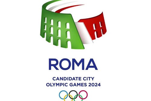
At this point in the competition, Budapest is automatically disqualified due to lack of an official logo (the city asked young Hungarian graphic designers to submit logos for consideration, and has narrowed them down to six shortlisted designs with the winner to be announced in the spring). So we’ll start with Rome, whose logo takes the shape of the Colosseum fading into a running track, colored in the red, white, and green of the Italian flag. It’s bland, uninventive, and looks a bit like Microsoft Word clip art, so it gets bronze (hey, it’s still on the podium).
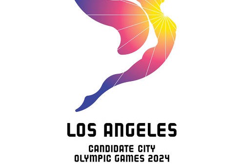
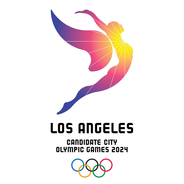
What about Los Angeles, whose logo was designed by 72andSunny and LA firmBruce Mau Design? In keeping with the bid’s slogan, “follow the sun” (as in “follow the sun to Los Angeles”), the logo features a rather victorious-looking angel silhouetted by the sun. The lemon yellow, sunny orange, bougainvillea pink, and Pacific blue form a sunburst along the angel’s body to give the design a distinctly California vibe.
Overall, it’s a nice representation of the City Of Angels—until you consider what itcould have been.
via Behance
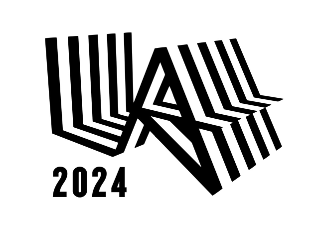
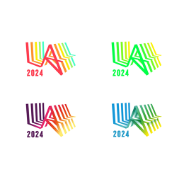
You see, this isn’t L.A.’s first 2024 logo. Last year after Boston won the right to bid for the 2024 Games but eventually dropped out over financial concerns, L.A. threw its name into the ring for the first time—and it did so with a very cool identity by M&C Saatchi LA and the Sydney-based RE:.
via Behance
Now that you’ve seen that one, isn’t it hard to look at the sunburst angel in the same way?
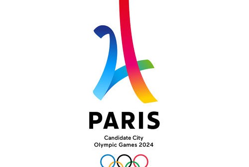
So, while L.A.’s second draft is great, Paris takes home the gold. Designed by Dragon Rouge, the logo is a clever play on both the Eiffel Tower and the number 24. It’s clean, modern, and it could easily stand on its own. The rainbow-hued ribbon forming the logomark skews a bit more sunny Los Angeles than dreamy Paris, but the architectural reference makes up for it. Based purely on aesthetics, it’s Paris for the win.

