VP, Creative Director L.A. Corrall (FKA L.A. Hall) at COLLINS is a Filipino-American multidisciplinary designer with over 15 years of experience leading brand identity and product design. His clients have included Robinhood, Nike, YouTube, Apple, and Google, and his work has been honored by D&AD, The ADC, Communication Arts, Type Directors Club, Webby Awards, and AIGA.
I recently had the special opportunity to ask Corrall his opinion on the highly controversial Nokia logo redesign. While it seems the internet has agreed on hating the redesign, Corrall offers a different perspective to help designers understand the deep thought and passion that went into the project.

What is your personal opinion on Nokia’s redesign?
I thought about three areas in which to evaluate the Nokia rebrand.
- What was the intent of the new logo, and was it successful?
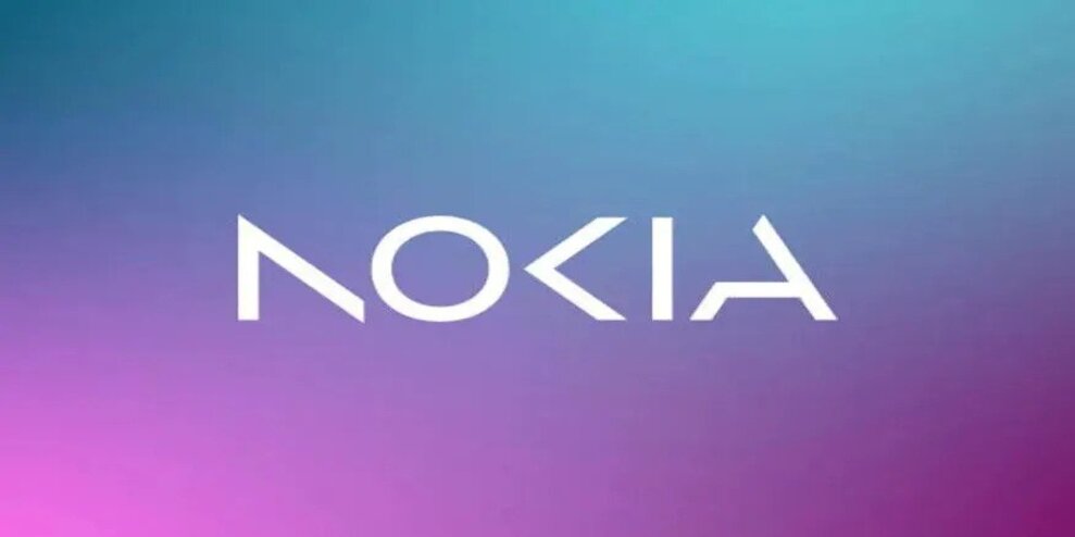
For a corporation of this scale and prominence, their new logo swings for the fences. It fully commits to representing the substantial shifts happening within the organization. It takes a lot of guts and belief in your future to jettison an iconic mark, especially one that’s been around for generations. Getting an organization of this size to take such a courageous step, much less agree to any new logo, is a Herculean feat in itself. If Nokia set out to signal to the world that they are undergoing massive change, then they have unequivocally done just that. It’s quite a statement.
- How well-executed and well-crafted was the logo itself?
Although the new logo is described as an “evolution of the 1960s classic,” it’s clear that the intent was a revolution. The previous logo feels as timeless, ubiquitous, and reliable as the iconic Nokia 3310 mobile phone. The new logo unapologetically grasps for its future, connecting imaginary lines— like cloud network technology.
It is cleverly described as “abstracted letters that, when acting together, read as Nokia” which ties well with their new purpose.
Will their B2B customers understand this? Immediately, probably not. Over time, probably yes. And that’s fine. But will Nokia employees who understand this deeper meaning appreciate the logo more? Inevitably. Especially as it is such a clear break from the past.
Does this pose legibility challenges? Sure. But legibility isn’t the problem. Readability is the issue: do I recognize what it stands for? And for any logotype, readability is a different and far more important measure. And there’s enough context and established recognizability of this brand to ensure readability immediately.
- How successful was the rebrand holistically?
All in all, the new logo takes bold risks formally in service of saying “new” and “future.” Only time will tell if they were overzealous or had remarkable prescience.
I think it will be the latter.

Can you describe how the process most likely happened? What do you think were the behind-the-scenes steps to make this change?
It will be conjecture based on my own experience, but let me suggest how design change at this scale often unfolds. Some brave brand leaders at Nokia had the daring and tenacity to instigate change from the inside, starting with a tight strategy and presenting huge implications for where their business is going, globally. They connected with the right leaders and had the right conversations to recognize that massive organizational change needed to be visually and operationally aligned, too. Again, for a company this large and historically influential (no matter the internal culture), this is an endeavor that must have taken uncommon persistence and drive over time before finding the right partners to continue on the journey. Congratulations to the good people at Lippincott.
What do you think Nokia’s goal was for this redesign?
Despite now being a predominantly B2B brand, Nokia clearly wanted to signal to the world that Nokia is changing— strategically and as a business— and they wanted to do it in a bold manner. They wanted a javelin thrown into the future. This logo is the sharp end.
Are people’s beliefs in thinking it’s similar to Kia’s redesign correct? Do you think this is a fair comparison?
There is a shared impetus for these new logos to communicate newness and innovation. Beyond that, it’s too convenient, if not reductive, to point at two recent corporate rebrands and conclude that they took the same paths to arrive at their solutions. It’s too easy to flatten what were inevitably highly nuanced and complex journeys to get to both destinations.
Just because there are similar notes between the two logos does not mean they are the same story.
Amateurs seek similarities. But the intrigue and the real story is in all the differences.
If you were to change the design, how would you change it and why?
The new logo has a commanding presence across the entire rebrand, so it was likely that the rest of the system would, intentionally, land more quietly by contrast. At the risk of sounding critical in light of how much I like the new logo, if I was the lead on this, I would hope that the rest of the brand system catches up.
A few questions from me: Will there be an opportunity for all of Nokia’s imagery to carry the theme of “acting together?” Will their design principles stretch— like the new logotype itself— beyond what’s expected of large corporate identity programs? Could each expression pick up the baton from the new logo and race everything further into this new future that they are claiming? Given such an ambitious new logo, are there new opportunities for other elements like photography, typography, color, interface design, and even tone of voice to more emphatically evolve?
My hope is simple: I look forward to seeing how the whole system will catch up. The new Nokia logo took a courageous, startling leap into tomorrow. It is halfway down the track and not looking back. Well-played, everyone.
ENDS
—
This article first appeared https://www.printmag.com
Seeking to build and grow your brand using the force of consumer insight, strategic foresight, creative disruption and technology prowess? Talk to us at +971 50 6254340 or engage@groupisd.com or visit www.groupisd.com/story


