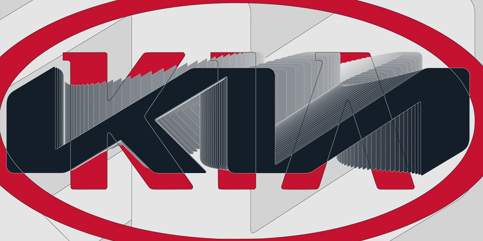
Kia has a logo problem: namely, that people can’t quite read it. The recent revelation that the company’s new logo causes 30,000 people a month to Google “KN car” sent the design world into a minor tizzy, resulting in a number of proposals to “fix” the logo by restoring the missing crossbar to its “A.” This unimaginative, too-literal approach is certainly an overreaction, tantamount to early suggestions that the hidden arrow in the FedEx logo be highlighted, so that viewers would be sure not to miss it.
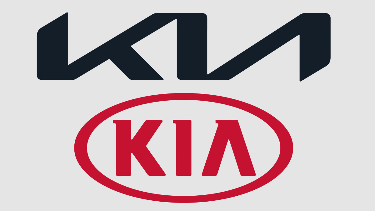
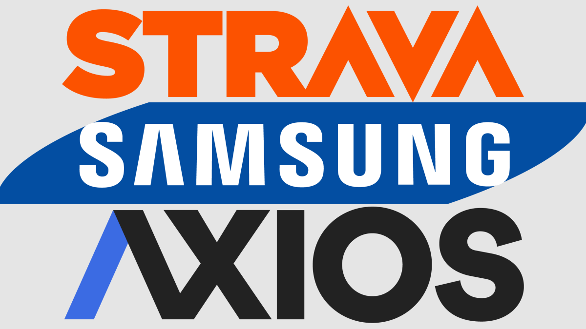
But it raises the question of why the crossbar was missing in the first place. And why, for that matter, was it missing from the old Kia logo? Or from the logos of Samsung, Almay, Axios, Konica Minolta, Stellantis, BBVA, Dacia, Strava, the Australian Open, Montblanc, and countless others? What do logo designers have against the crossbar?
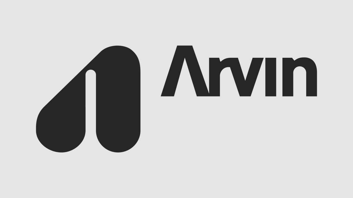
The crossbar-less “A” seems to have first started cropping up in the ‘60s. In 1964, rookie designer Bart Crosby was working on his first big project, a new corporate identity for Arvin Industries, a manufacturing company based in Columbus, Indiana, a town with a budding design heritage thanks to a 1950s architecture program subsidized by local engine behemoth Cummins. For the Arvin wordmark, Crosby dropped the crossbar of the initial “A” in order to have it visually reflect the “v” in the name. “I thought it might be too radical for the client,” he recalls, “but the reaction to it was, surprisingly, that they loved it.” He had created an early, if not the first, crossbar-less “A” wordmark.
Crosby went on to a long career capped by an AIGA medal in 2005, and crossbar-less “A”s proliferated across the American brandscape. Analysis of United States Patent and Trademark Office records shows that in 1970, just 1% of US logotypes with capital “A”s lacked a crossbar. In 2000, that figure was 2%. But by 2022, it had shot up to 9%.
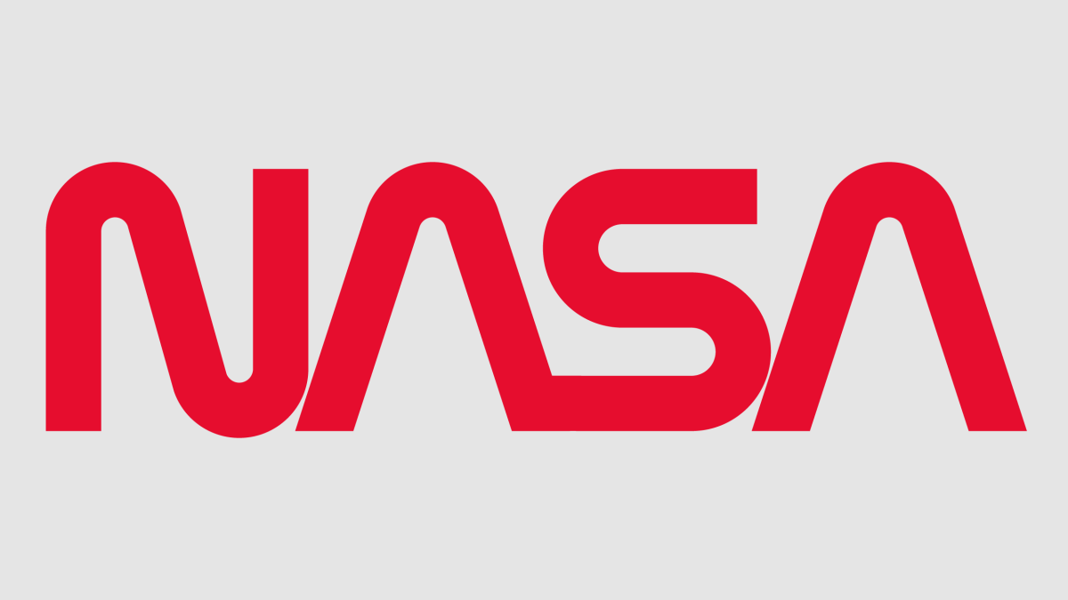
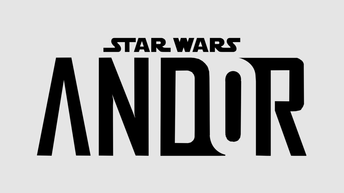
The appeal of the crossbar-less “A” seems to lie in its ability to suggest an air of futuristic high technology; its inclusion in NASA’s 1974 “worm” logo certainly went a long way in this regard. At a more basic level, the “A” freed of its crossbar transforms from a mundane, workaday letter found on every office keyboard into a symbol; a sleek chevron, a zenith, a pinnacle, an arrow forever pointing upwards. That may be why Disney went with a crossbar-less “A” for its recent Star Wars series, Andor. Using a crossbar-less “A” in a word adds an allure that is exotic and unfamiliar, which is why reinserting the bar into the Kia mark for the sake of clarity would be such a mistake.
Of course, there may be limits to the powers of the crossbar-less “A.”. Its overuse has made it ripe for parody; the logo for David Letterman’s production company Worldwide Pants, with a pair of pants as a crossbar-less “A” floating in outer space, is perhaps the best example. And now that the “A” has started to appear in mundane logos like those for churches and other organizations that are decidedly unfuturistic, it may begin to lose some of its innovative aura.
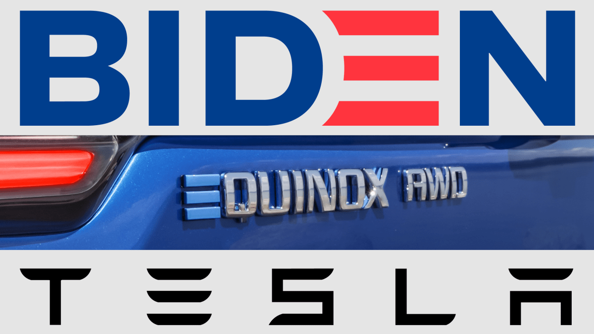
Meanwhile, though, a new crop of logos such as those for Tesla, Chevrolet’s electric vehicle line (via its Ultium battery mark), and even President Biden have begun sporting a capital “E” that dispenses with the letter’s left-side stem, leaving just three parallel bars that seemingly defy gravity. Watch out, crossbar-less “A,” the next vowel of the future may be here to take your place.
—
This article first appeared on www.fastcompany.com
Seeking to build and grow your brand using the force of consumer insight, strategic foresight, creative disruption and technology prowess? Talk to us at +971 50 6254340 or engage@groupisd.com or visit www.groupisd.com/story

