In a digital age, your logo can be as dynamic and interactive as your social feeds. If only someone had told MetLife.
It was only two weeks after MetLife unveiled its new logo—the centerpiece of its first global rebranding in three decades—that the company was forced to defend itself against accusations of theft. As it turns out, the insurance giant’s new logo is nearly identical to that of Diffen, a website that (appropriately enough) provides side-by-side comparisons of competing objects (Tylenol vs. Advil, mold vs. mildew, Clinton vs. Trump).
Though MetLife swore the similarity was a coincidence, it couldn’t deny that Diffen had a point. The two logos are practically identical. And it’s hardly an unusual occurrence. Take, for example, the similar circular logos of Chanel and Gucci, or the winged symbols of Bentley and Mini, or even the stylized “Ms” in the Motorola and Marmot icons. It’s a scenario that designers and creative directors have long dreaded: working for months to produce a unique, brand-specific logo only to discover your creation is uncomfortably similar to an existing one, resulting in customer confusion, potential litigation and one royally pissed-off client.
Such fears are just some reasons why brands are moving beyond flat, motionless symbols for their corporate identities toward dynamic, ever-changing entities known as “living logos.”
“The whole purpose for logos is to create a relatable mark so that people can look at it and know your company,” said Kyle Arango, creative director at digital agency Huge.
But as consumer interaction with brands become increasingly digital, “you can build systems of identities where logos are always alive,” he said. “They’re still recognizable, but you will never get into those situations where things look alike because they” are always changing.”
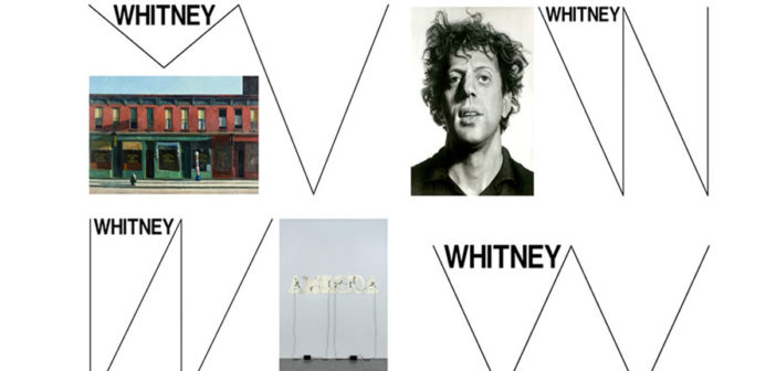
Last year, Goodby Silverstein & Partners built a new logo for data-storage company Seagate that, when looked at closely, displayed some of the data flowing through its system. The Whitney Museum in New York recently swapped its W logo for an ever-morphing series of lines that adjust to the size of one’s browser.
Not only do such logos help brands avoid accidental trademark infringement, they turn a flat, lifeless symbol into another touch point for consumer engagement. “Living logos personalize—it’s the future,” said Rich Silverstein, co-founder of Omnicom’s GSP, which is based in San Francisco. “We don’t like anything static anymore.”
Logos have come a long way since the early 6th century BC, when humans used branding to distinguish cattle, trade goods, coins and coats of arms. It wasn’t until 1875, when the UK began accepting applications for trademarks, that logos and brands became inseparable, according to “A History of Graphic Design” by Philip Meggs. UK-based Bass Brewery, makers of Bass Ale, was the first brand to place its logo under copyright.
In some ways, the concept of a living logo isn’t unique to the digital age. In the 1980s, televised MTV promos featured a logo in which the “M” was constantly chaning colors. According to Arango, this was the first time a logo went from being static to animated.
Soon after, the dawn of the internet brought advertisers new options. Google was one of the first adopters of logo animation on the Web. The first Google Doodle to be animated was written in JavaScript in January 2010 to celebrate the 366th birthday of Isaac Newton. In it, a simple apple falls from the logo, recalling the famous anecdote of how Newton came up with his theory of gravity.
In May of 2010, Google went further for Pac-Man’s 30th anniversary. It created an interactive logo where users could play a game of Pac-Man around the word “Google.”
Now, said Arango, we are moving into a time where brands need to make their logos feel more like “two-way conversations.” He said static images aren’t tailored for a digital world where people are always on their phones. “People are interacting with brands and are shaping them just as much as the companies are,” he said.
Dave Waite, brand strategist and creative director of Zookeeper, a digital creative studio in LA, the change is enabled by advancements in technology like updated browsers and the introduction of HTML5. “Back in the day, logos would appear on all your stationery and on your website and maybe magazine or print ad,” he said. “Today it’s changed dramatically. You can do anything you can absolutely imagine.”
“There are ways now,” said Arango, “where algorithms can respond to how people are interacting with your logo, so that your logo could shape or morph, or your tagline could change, to what is really going on in users’ lives right now.”
Perhaps the best example of this is Google’s recent visual rebranding. In 2015, Google created an animated logo with three parts—a logo, a set of dots and a monogram. The dots interact with the user on Google’s app, displaying six different animations depending on whether the browser is listening, thinking, replying, etc.
Because it’s more flexible, a living logo can more accurately capture the personality of a brand, said Arango. “It’s a tough thing to try to embody everything that a company is about in a low-graphic mark or three-word sentence.”
But static images and living logos aren’t mutually exclusive, said Brian Pennington, design lead at Indianapolis-based Studio Science. “The idea isn’t to replace static logos—it’s to make logos as communicative as possible,” he said. “A library of tens or hundreds of logo options might allow you to communicate something more than a single image.”
For instance, before the Whitney Museum opened its new building in New York in 2015, it partnered with design studio Experimental Jetset to develop a graphic, fluid approach to branding. What developed was a large static “W” that can bend and fit to wherever it is appearing. For example, users can visit whitney.org and resize their browsers to see how the “W” adapts. Such a dynamic symbol reflects the building’s architecture and dynamic perspectives of its visitors, said Pennington. “More than a logo, it’s a system designed to make the most of each piece.”
Silverstein had never heard of a living logo when he proposed one to Seagate, he said. But it seemed like the obvious solution for a data company looking to update a teal-green logo that was stuck in the 1980s.
Silverstein said he immediately thought of an idea for a logo that would be almost alive, coining the phrase “living logo” within the agency. His idea was to have real-time data that the company stored flow constantly through the brand’s current “S” monogram. Headed by Silverstein, GSP took APIs from Amazon, Twitter and Getty and streamed whatever they wanted through the logo. Silverstein said it resembled “blood inside a body.”

“When I say living,” said Silverstein, “it is literally showing you what books are being sold on Amazon at the moment. That’s what’s interesting … not that it moves, but that it is connected directly to the data that Seagate stores.” (It even has the power to stream Hillary Clinton’s emails, joked Silverstein.)
For the project, the agency started a beta group, created a prototype to pitch the client and worked with an outside coding company to produce the actual logo. “In the pitch,” said Silverstein, “the minute they saw it move, they were like, ‘We’ve got to do this.’” After they won the account, Silverstein filed a patent for the design, a first for him and the agency.
GSP is continuing to work on living logos. Currently, the agency is working with an unnamed client to design one that deals with outer space.
Although Arango wouldn’t reveal the clients, he said Huge is also working on living logos that will be unveiled early in 2017. “The stuff we are working on is building in algorithms and AI that allows us to sense current moods of the user or other inputs or world events, and bond that to the behavior of the logo to make it seem more relevant,” he said.
How widely adopted such logos become remains to be seen. And as several designers pointed out, even brands with living logos still need flat, static ones, whether for print ads, business cards or letterhead. And the creative process for developing a living logo still requires the creation of an old-fashioned one.
“You have to start with the two-dimensional to get to the three-dimensional, and then the fourth-dimensional, whatever that would be,” said Silverstein. “Marks are still important. It’s just that there is more for a mark to do nowadays—it can play; it can come alive and go dormant again. It can talk, it can sing, it can change colors. My God—it’s alive!”
But Arango said that in the next 20 years, there might not be a need for print designs at all, especially as more out-of-home advertising transfers to digital and print continues to decline. “As we get better at being more relevant to the user,” he said, “the more living logos will come to life.”
“Good or bad,” said Silverstein, “the world is constantly moving. We are on a carousel.”
This article first appeared in www.campaignlive.com
Seeking to build and grow your brand using the force of consumer insight, strategic foresight, creative disruption and technology prowess? Talk to us at +9714 3867728 or mail: info@groupisd.com or visit www.groupisd.com


