The cold blue light of modern touchscreens may be aesthetically pleasing, but it poses health problems. Designers and technologists should take cues from military history and embrace the orange.
When I was 14, I saved up money from my first web design job to trick out a really nice gaming PC. I outfitted my computer with tons of blue LED fans, and I kept it on at night, right next to my bed. Shortly after, I realized my sleep patterns were changing. While I wasn’t staying awake any later, it now took me longer to get to sleep. Was I eating differently? Was it just a part of being a teenager? Was it the light in my room? But the orange light from my ’80s era alarm clock wasn’t keeping me up. I finally determined that it must be the particular shade of blue light from my new computer. It took me some research to realize all this, but once I did, I started turning my computer off at night. Problem solved. And when I bought my next computer, I ordered fans with orange lights.
The bright blue light of flat, rectangular touch screens, fans, and displays may be appealing from an aesthetic perspective (more on that below), but from a health standpoint, it is fraught with problems. Blue light inhibits the production of melatonin, the hormone that regulates our sleep cycles. Blue light before bedtime can wreak havoc on our ability to fall asleep. Harvard researchers and their colleagues conducted an experiment comparing the effects of 6.5 hours of exposure to blue light, versus exposure to green light of comparable brightness. They found that blue light suppressed melatonin for about twice as long as the green light and shifted circadian rhythms by twice as much (3 hours compared with 1.5 hours). And worse, it’s been linked in recent studies to an increased risk of obesity and some cancers.
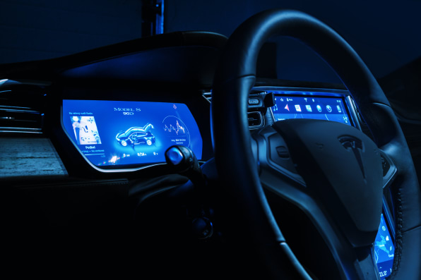
A decade after my experience with the LED fans, I started seeing blue displays everywhere. From mobile phones to in-car displays, blue lights were becoming the norm. It’s hard for me to think of any examples of prominent high-tech products on the market now without pale blue screens or indicator lights. LED-based bulbs with more blue light are fast replacing incandescent bulbs. The default display to our iPhones and Androids operates along the blue spectrum, as do our laptops; new cars, especially those like Tesla which aspire to be “futuristic,” come with blue-lit dashboard displays, and so do our “smart” appliances, televisions, video game consoles, watches–the list goes on.Thanks to the rapid growth of connected devices and digitized appliances, blue light is now flooding into our lives in places where we’re most vulnerable. It’s why, for instance, when we stumble into the kitchen late at night for some water, we’re guided by the illumination from the touchscreen on our refrigerator–and the after-image of the screen leaves us half-blind, and once back in bed, half-awake.
THE RIGHT COLOR FOR DENSE INFORMATION
It could be argued that the average person today manages as much information with their devices as an intelligence officer in a wartime situation. But from the Cold War up to now, the user experience of military and consumer technology has vastly differed: Airplane cockpits, submarines, and other military-grade systems are specifically designed for information density, with primary, secondary and tertiary information sources. A key difference in all of these interfaces is color–by and large, many military displays are deep red or orange.
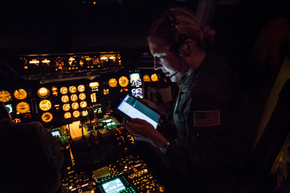
Why use orange and red in military interfaces? They’re low-impact colors that are great for nighttime shifts. In addition, bright blue light is more likely to leave visual artifacts, especially in darkened environments. Have you ever been blinded by the display in your car–or on your phone–when you switch back and forth between looking at that screen and the road ahead? Because the screen is a brighter block of high-energy light, driving (or for that matter, walking) at night creates a longer, stronger afterimage that can adversely affect us when our eyes return to where we’re going.
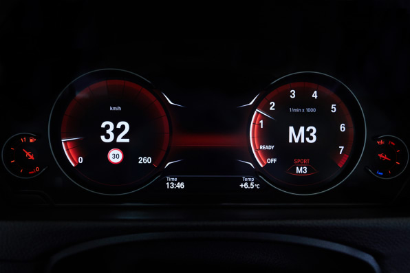
BMW is a rare exception in the orange vs. blue design divide, because the car company follows the military’s reasoning: Since the ’70s, BMW has made its cars’ dashboard cluster lights with a red-orange hue, at a wavelength of 605 nanometers. This allows drivers to see the instruments clearly, the company found, while also enabling their vision to quickly adjust to the outside darkness after quickly glancing down; red-orange light also caused less eye fatigue.
2001, BLADE RUNNER, AND CULTURE’S BLUE SHIFT
Somewhere along the line, blue took over in the public consciousness as the “color of the future,” while orange began to look like a shade from the Reagan ’80s. In our current culture, blue signals a transition from the past to the present, from the analog to the digital.
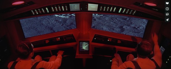
Movies and television greatly helped drive this shift. In the late ’60s, the landmark depictions of the future, 2001: A Space Odyssey and Star Trek, conveyed a relatively optimistic vision for humanity, in which we are able to transcend wars and other conflicts to explore the stars–on spaceships controlled, in both case, with user interfaces that were predominantly orange and red-orange.While both remain widely loved and admired, they’re sometimes perceived as naive and dated. (Never mind that the iPad was inspired by Star Trek‘s PADD devices, or that we saw video-based messaging for the first time in 2001.)
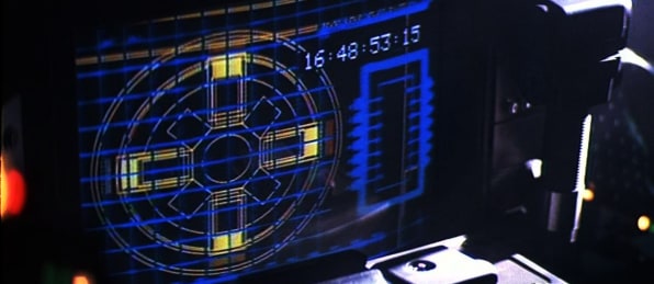
After premiering in 1982, by contrast, Blade Runner quickly grew in influence as a cult classic among filmmakers, artists, designers, and advertisers. Ridley Scott’s depiction of the future was believable, compelling, and most of all, dark–both figuratively and literally. The blue light from pervasive display screens depicted in the movie fit its shadowy film noir aesthetic, and inadvertently became one of the core tenants in our default mental image of “what the future looks like.”
REMAKING THE FUTURE WITH A WARMER SHADE
If pop culture has helped lead us into a blue-lit reality that’s hurting us so much, it can help lead us toward a new design aesthetic bathed in orange. We need a resurgence of more realistic user interfaces in movies and TV–which by definition, will skew away from blue. Designers and technologists can help teach audiences to expect more from how user interfaces are depicted in their movies. (Inspiring them to worry, for instance, if Ethan Hunt will have a headache from looking at too many impossible mission messages on a blue screen.) Film effects designers can even take their talents into real product design, as Mark Coleran recently did.
Popular culture is only one way to reshape users’ expectations around interfaces. Startups, blog posts, news articles, and podcasts can help increase general awareness. Popularizing the risks of blue light and re-educating the public about the functionality of orange and red light is the first step, but companies need to take the next steps to build interfaces that are tested, human-centered, and functional into real world design.
None of this is meant to suggest a universal ban on the color blue. Car and appliance displays, for example, could still emanate a futuristic blue during the day–as long as that light switched to an orangish hue as evening comes. At least allowing consumers the option might be a good first step. This presents a problem, as many people fall asleep with phones in hand, watching Netflix or binge-browsing Reddit.
One example is Flux, a Mac app that changes the color of your computer’s display to match the time of day. Instead of a bright blue screen at night, you’ll experience a warm, orange-hue that will help you wind down for a successful night of sleep. In the day, the display changes back to a bright white, matching the sky outside. Following Flux’s lead, Apple released Night Shift, bringing the features of Flux directly into the Mac operating system. iPhone users can now use Night Shift and the less-known Color Tint feature, and Android users can download Twilight for their screen-dimming needs. I hope this new trend extends to all devices, and that we see a world lit by LEDs in warm spectrums.
For military designers, creating an effective, comfortable user experience has always been a matter of life and death. Consumer device designers must begin with a similar perspective. Too much is already at stake.
–
This article first appeared in www.fastcompany.com
Seeking to build and grow your brand using the force of consumer insight, strategic foresight, creative disruption and technology prowess? Talk to us at +9714 3867728 or mail: info@groupisd.com or visit www.groupisd.com

