Last week Google unveiled its redesigned, mobile-friendly logo, which updates the font from a crisp, sharply defined san serif wordmark, to a blockier, rounded sans-serif.
Despite its cutesy introductory animation on Google’s homepage, the new logo made me uneasy. Both at work and outside it, I’m dependent on Google’s search-engine. On some days it’s my one constant, and while that sad fact should probably unsettle me more than the subtle logo alteration, Google’s move threw me nonetheless. I wasn’t alone. “I hate it,” my friend announced over Gchat. “It looks like the scribbling of a child.”
An informal Ad Age poll showed that most readers were also against the shift, and the reaction on social media – which, to be fair, tilts toward negative reviews – was decidedly underwhelmed.
So the new @google logo uses a sans-serif font…….I guess it could always be worse. pic.twitter.com/W5b0TKo3wQ
— Kyle (@foreverakyle) September 1, 2015
and now a moment of silence for the new google logo and the people who think it looks good
— Lane Moore (@hellolanemoore) September 3, 2015
Google’s new logo will look great on the front of my fridge. http://t.co/9mXD6xMVvi
— Adi Robertson (@thedextriarchy) September 1, 2015
Still, compared with other famously disastrous logo updates, the critical response was muted.
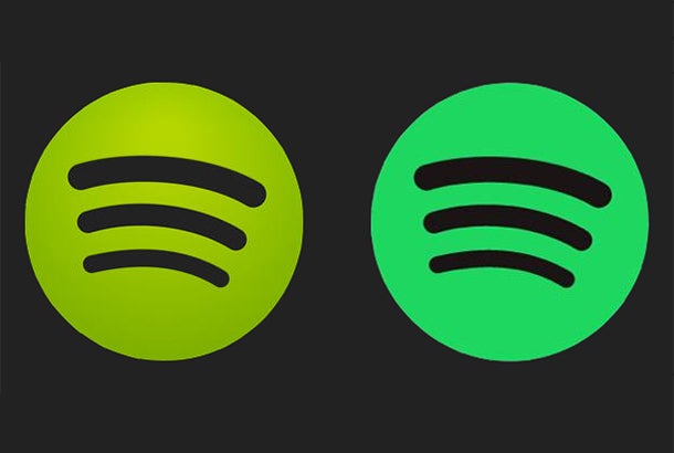
Whether it’s Tropicana’s 2009 packaging makeover and Gap’s revamped logo in 2010, it’s easy to draw up a list of recent logo makeovers that, at least initially, landed with a thud. There’s Airbnb’s much-mocked redesign, Hershey’s equally maligned update and the social-media meltdown that accompanied Spotify’s decision to adjust its logo’s bright green to a cooler variety.
SPOTIFY PLEASE CHANGE THE COLOR OF YOUR LOGO BACK TO THE NORMAL GREEN SINCERELY EVERYONE
— tarly !! (@lueeeeek) June 16, 2015

While it’s possible to dredge up a long list of additional logo re-dos that have offended, it’s far more difficult to unearth a logo redesign that was immediately embraced.
Why do logo redesigns upset us so much?
It comes down to identity, says Karen Winterich, an associate professor of marketing at Pennsylvania State University. Consciously or not, we internalize the brands that we admire (and want to align ourselves with) as well as the brands that are a part of our daily lives. As the consumer-facing symbol of a brand’s packaged identity, when a logo changes we expect the underlying brand to change as well, which helps explain the intensity of consumers’ negative reaction to Apple’s logo update in 1999 (people tend to identify closely with the brand), and my reaction to Google’s update (the company’s logo is very much a fixture of my day-to-day routine).
In general, the stronger our associations with a brand, the more negatively we react when its logo changes. In one study, Winterich had 632 college students respond to logo redesigns for Adidas and New Balance athletic shoes created by professional graphic designers. For participants who expressed weak ties to the brands, the refreshed logos went over smoothly. Those who expressed a strong connection, however, tended to react negatively to the redesigns, which affected their attitude to the brands as a whole
With every redesign, then, a brand risks alienating its core audience, a group that – through the megaphone that is social media – can easily vocalize its displeasure.
"All I can see is the emoji poo." With Apologies To Hershey's Chocolate Company: Your new logo kinda stinks. https://t.co/zOeIql57U5
— Traci Sampson (@_TraciwithanEye) December 28, 2014

As consumers, we’re typically wary of change, says Michael Walsh, an associate professor of marketing at West Virginia University. “Brands tend to overlook the impact a [logo redesign]can have.”
So why redesign at all?
Sometimes the risk of negative feedback is worth it. When a company significantly modifies its product, service, structure or the way it does business, “a redesign can be a useful way of signaling to the rest of the world that things are changing,” says Walsh.
It’s when a company revamps its logo or packaging for the sole purpose of revamping its logo or packaging that the situation can get precarious. Take Tropicana. In 2009, the beverage company rolled out a package overhaul for its Pure Premium line, swapping its recognizable logo (an orange, with an inserted straw) for a brighter, blockier more stylized Peter Arnell design. The negative reaction from consumers was swift –as was the corresponding 20 percent sales plunge, which forced the company to backpedal. Less than two months after the new packaging was unveiled, it was scrapped in favor of the original design.
Walsh speculates that much of the negative sentiment originated from the lack of substance behind the update. “To me, it appeared to be driven more by a desire to shake things up – a new look for the sake of a new look,” he says. “There wasn’t enough of a reason to change the packaging, and consumers called [Tropicana] on it.”
If you’re going to change the logo, articulate why
For companies considering a redesign, it’s important to be transparent, says Winterich. Whenever possible, she advises that brands inform consumers that change is coming, instead of pulling the rug out from under them.
Warning consumers that a redesign is about to launch punctures any corresponding buzz and drama, so it’s understandable that companies often avoid that route. Still, it’s possible to preemptively quell negative consumer reactions by explaining the thought process behind the update.
When Starbucks changed its logo in 2011 – liberating its green Siren from a circle and shedding the surrounding ‘Starbucks Coffee‘ — the company outlined its reasoning for making the change, namely that the company was moving beyond just coffee products. It also acknowledged that not everyone was going to initially like it. “[Starbucks] asked consumers to give the logo time,” says Walsh. While there was a flurry of intense negative pushback, the discontent “eventually quieted down.”
In Walsh’s view, Google’s redesign was expertly handled. When the new logo was unveiled, the company released a corresponding sleek video and blog post detailing what, exactly, the mobile-friendly revision signified:
Today we’re introducing a new logo and identity family that reflects this reality and shows you when the Google magic is working for you, even on the tiniest screens. As you’ll see, we’ve taken the Google logo and branding, which were originally built for a single desktop browser page, and updated them for a world of seamless computing across an endless number of devices and different kinds of inputs (such as tap, type and talk).
At the end of the day, some companies can afford to stick to their guns more than others. “You’re not going to stop using Google just because the logo changed,” says Winterich. (She’s right, of course. As much as my friend hates its childlike aesthetic, she’s tethered to Google along with the rest of us.)
For the majority of companies that lack Google’s gravitational pull, here’s a rule of thumb: If it’s possible to write a convincing blog post that justifies the redesign, go for it. If not, consider leaving well enough alone.

